Case study
Building an Accessibility-First Component Library
This case study highlights the creation of an accessibility-first component library built with React and Radix Primitives. It was designed to address persistent WCAG violations and fragmented UI across platforms by embedding accessibility, semantic structure, and design-code parity into every layer. The system uses design tokens, Storybook documentation, and Figma Dev Mode integration to enable inclusive, scalable development across teams.
Summary
This project started with a clear goal: build an accessibility-first component library that could serve as the foundation for consistent, inclusive, and scalable digital experiences. Across the platforms this system supports, accessibility issues were common—ranging from poor keyboard handling and missing focus states to low contrast and unstructured markup. Many components failed to meet baseline standards, and teams struggled to implement fixes consistently.
Rather than retrofit accessibility onto legacy components, we built the system from the ground up with accessible patterns as the baseline—not the edge case.
Why It Exists
The Problem
- Widespread accessibility issues affecting screen reader users, keyboard-only navigation, and users with color or motion sensitivity
- Fragmented UI implementation leading to inconsistent experiences and duplicated effort
- Poor alignment between design and engineering caused repeated rework and low confidence in component reliability
The Goal
- Create a modern, accessibility-driven React component library that could scale across teams
- Provide structured documentation and usage patterns that enable contribution without risking compliance or consistency
- Ensure visual and code parity across design and development
How It Works
Engineering Architecture
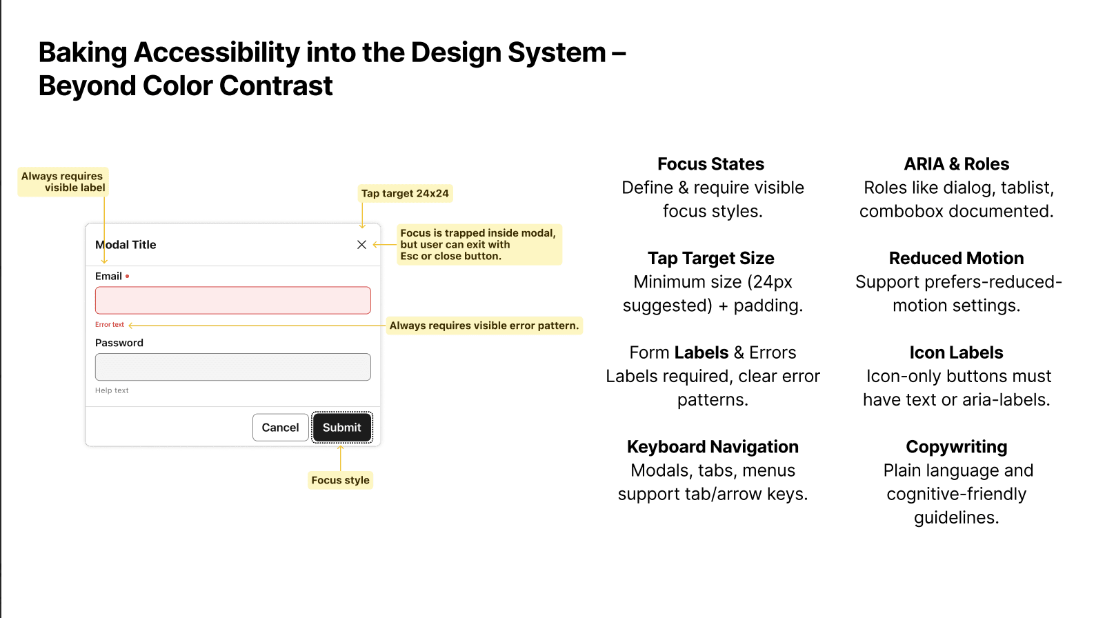
- Built using React and Radix Primitives to ensure strong semantic structure, keyboard handling, and ARIA compliance
- Styled with CSS Modules and system tokens for isolated and maintainable styling
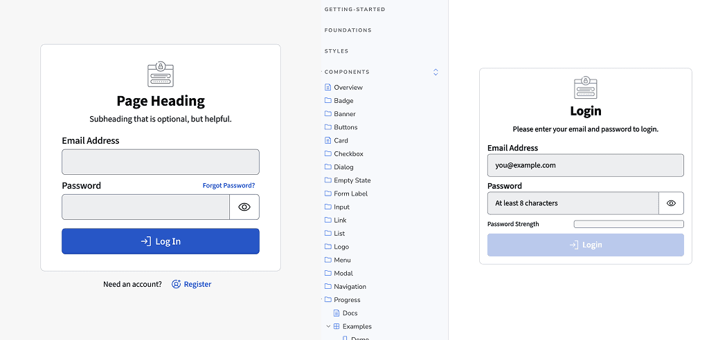
- Key components include:
- Buttons, Inputs (with Addons and Labels)
- Modals with focus traps, escape handling, and labeled regions
- Menus, Popovers, Side Navigation
- Tables with keyboard-accessible sorting, pagination, expanding rows, and screen reader support
Table Component in Action
System Integration
- Design tokens are generated using Style Dictionary, supporting modes, themes, and semantic aliasing
- Token files are shared across design and development, ensuring parity
Tokens, Tokens, Everywhere
- Figma components are authored with live token sync and structured layers for clear mapping to code
Theme Switching with the Modal Component
Outcomes
Outcomes
- Significantly reduced accessibility violations across supported products
- Enabled designers and engineers to build inclusively by default
- Reduced rework by improving design-engineering collaboration
- Laid the groundwork for consistent UX, visual theming, and contribution workflows
Final Thoughts
This system wasn’t just about building UI—it was about baking accessibility and trust into every layer of a design system. We created something sustainable, scalable, and inclusive by default. It empowers teams to build faster, smarter, and more responsibly.