Case study · Cybersecurity SaaS
Specs as the contract. Figma and code as adapters. Zero drift.
I came in to rebuild a Series-B cybersecurity SaaS's design system from the ground up — not just the components, but the production line that makes them. Solo, against a brand-refresh deadline already on the calendar.
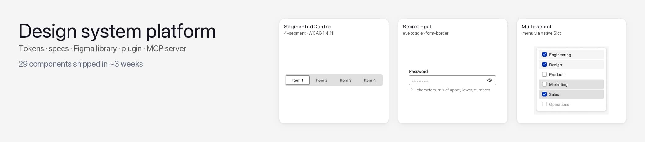
- Design Systems
- Figma + Code Connect
- Style Dictionary
- MCP
- Radix + Tailwind v4
- WCAG 2.1 AA
- Dark Mode
- Token Architecture
- Monorepo (nx)
- Spec-driven
The problem you’re reading about
The company had a code-side design library that grew organically — components had hardcoded colors, no shared token contract, no Figma counterpart for half the inventory, and the few Figma components that existed drifted from code. A brand refresh was scheduled in 6 weeks, which meant every visual decision needed to be re-anchored to tokens designers could actually edit.
The structural problem wasn't "we need more components" — it was "we have no production line, so every component is a bespoke decision someone has to remember."
Approach
Build the system as 3 layered packages (tokens → specs → components) plus 2 tools (Figma plugin, MCP server) instead of jumping straight to components. The spec layer was the key decision: spec JSON is framework-agnostic, sits between Figma and code, and gets consumed by adapters on either side.
This rejects the more common pattern of "Figma is the source of truth, generate code from it" (which makes engineering wait on design) and the inverse "code is the truth, document in Figma later" (which leaves designers in a stale file). With specs as the contract, both sides build adapters in parallel.
I also rejected building one giant "kitchen sink" package — the 3-package split lets tokens publish on a different cadence than components and the spec contract version independently.
What I rejected
- Figma as the single source of truth — makes engineering wait on design, locks the code-side speed to design cadence.
- Code as the source of truth with "we'll document in Figma later" — leaves designers in a stale file forever and quietly breaks trust.
- One giant package that ships everything together — couples release cadence, makes the tokens layer carry the weight of every component change.
Build
7 phases. Each one is a discrete deliverable that ships before the next starts — token foundation first, then the system makes everything above it possible.
- 01
Foundation week
3-package monorepo (nx), shared tsconfig, build pipeline. Tokens package with Style Dictionary pipeline producing CSS + JSON + Tailwind v4 outputs. ADR template + first 6 ADRs landing the architecture decisions (color naming, component-tokens-only-on-divergence, package boundaries).
Evidence · 3 packages (tokens / specs / components), 20 ADRs in docs/decisions/, Style Dictionary build at packages/[tokens]/build/ producing dist/css/ + dist/json/, nx.json + tsconfig.base.json
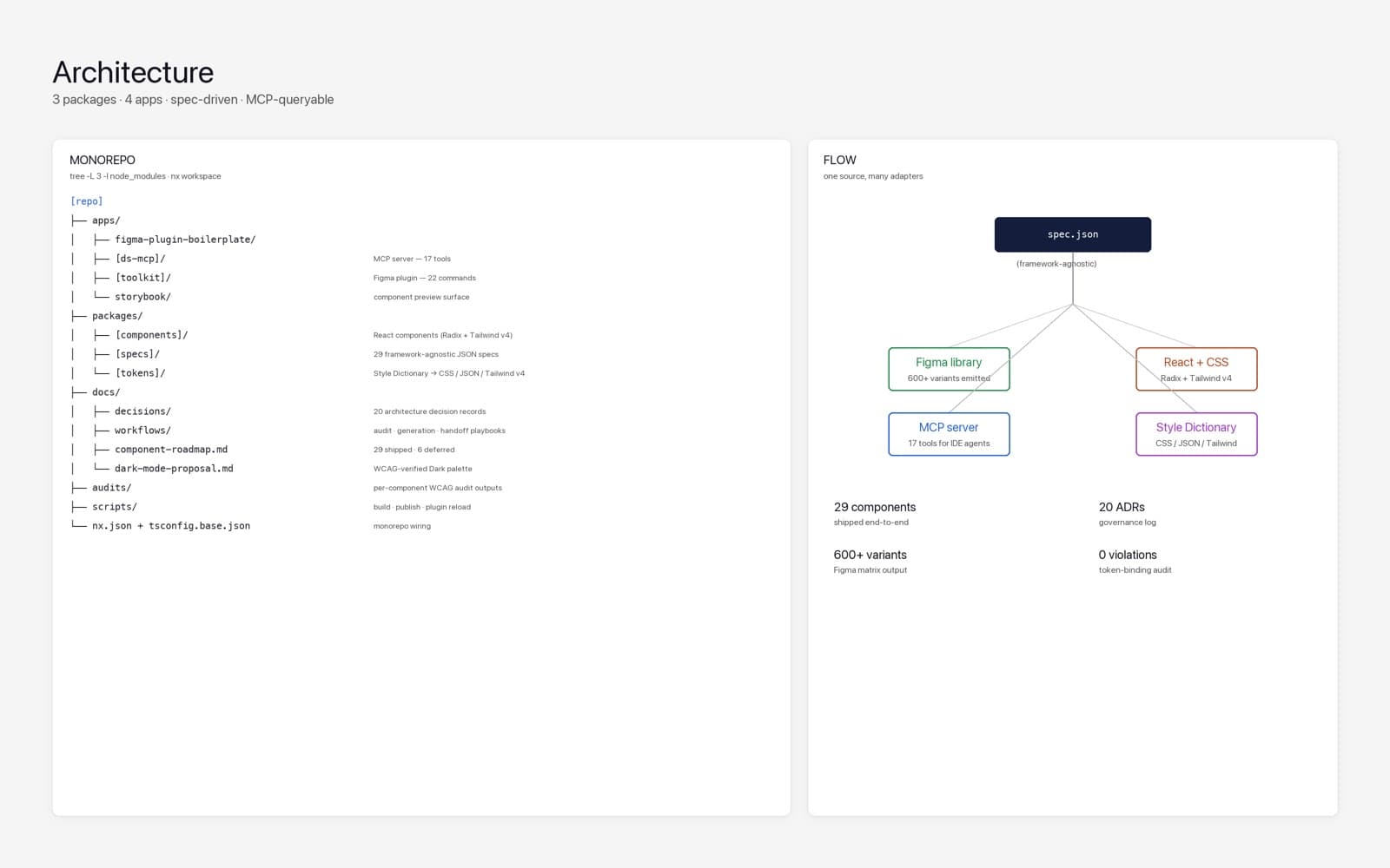
Monorepo layout — tokens / specs / components as packages, Figma plugin + MCP server + Storybook as apps, governance under docs/. - 02
Token system
Two-tier token model: 91 primitives (hue ramps, sizes, font stack) + 111 semantic tokens (color/background/default, color/border/form, type/label/md, etc.). Light + Dark modes for every semantic color. Custom non-standard primitives where needed for AA contrast (red/38, danger/86) instead of forcing the canonical 100-step ladder.
Evidence · 202 leaf token entries across 3 source JSON files. Light + Dark modes in Figma's Semantic/Colors collection. New tokens added when a real WCAG audit fails an existing one — see color/border/form (PR #19, 1.4.11 fix).
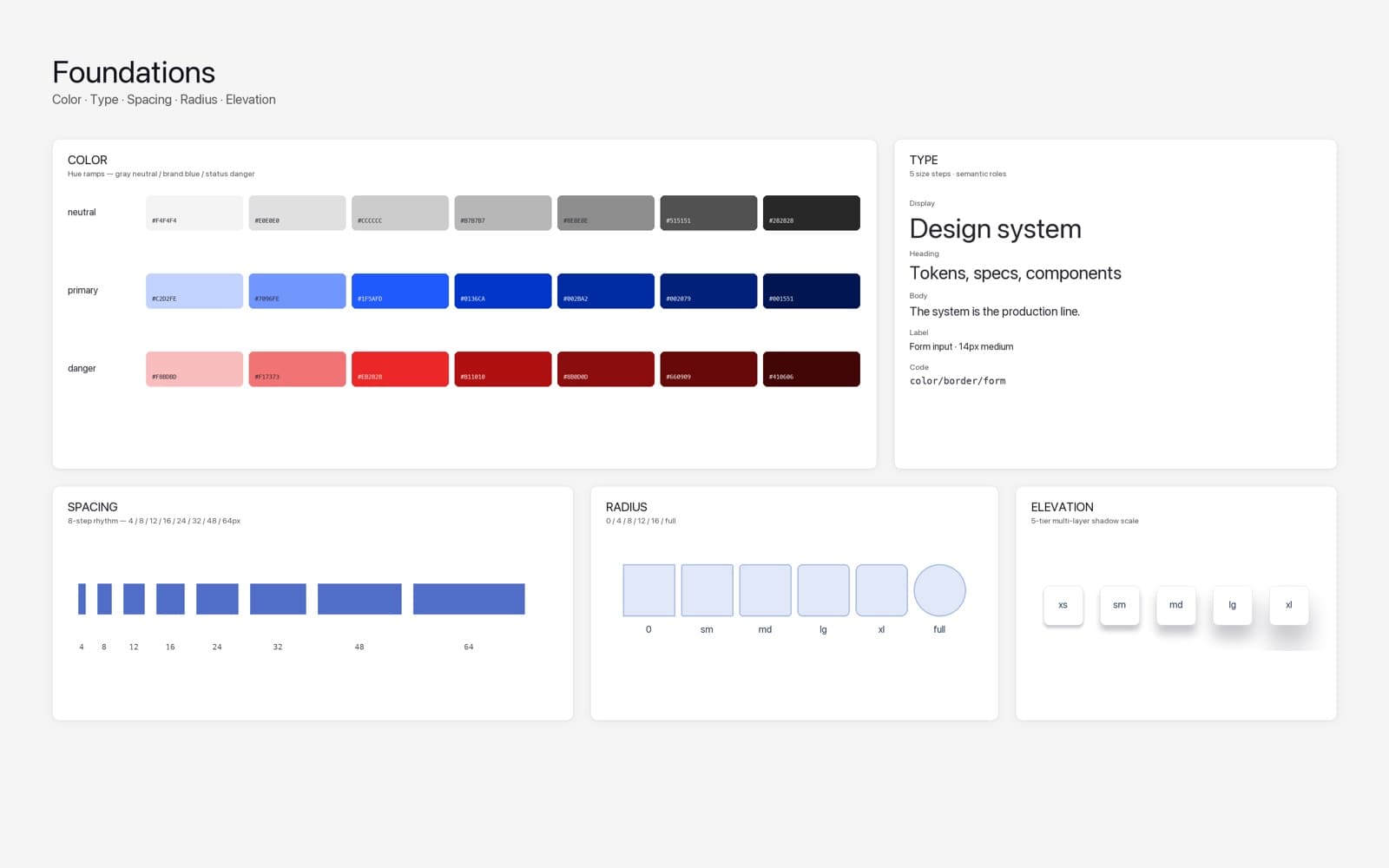
Two-tier token model — primitives feeding semantic aliases. Light + Dark side-by-side. Tokens added only when a real WCAG audit fails. - 03
Spec layer
29 component specs as JSON, each with anatomy / props / variant axes / states / tokens / accessibility requirements / figmaLimitations / consumerNotes. Specs are framework-agnostic — Figma + Base UI consume the same source. Hidden "atom" specs (leading-dot Figma names like .input, .menu) for scaffolding shared across multiple molecules.
Evidence · 29 spec files in packages/[specs]/specs/. 7 visible primitives, 7 hidden atoms (.input, .menu, .menu-item, .menu-trigger…), 12 interactive atoms (Button, IconButton, Link, Input, Tooltip, Textarea, CharacterCounter, Checkbox, Radio + RadioGroup, Switch, SegmentedControlItem, SecretInput), 1 Tier 2 molecule (SegmentedControl).
- 04
Figma library
Every spec emits a Figma component-set with full variant matrix, all paints bound to tokens (zero hardcoded colors), Figma Limitations callout per component documenting where Figma's API can't represent the spec contract, and a Dark Mode Audit section with explicit variables-mode pinning so designers verify both modes visually.
Evidence · ~600 Figma component variants total. Button 162, IconButton 162, Checkbox 36, Radio 24, Switch 24, Avatar 15, Progress 20, Menu atoms 69 (.menu 3 + .menu-item 30 + .menu-trigger 36), SegmentedControlItem 16, SegmentedControl 8. 0 hardcoded paints — every fill/stroke bound to a semantic variable (verified in Dark Mode Phase 1 audit).
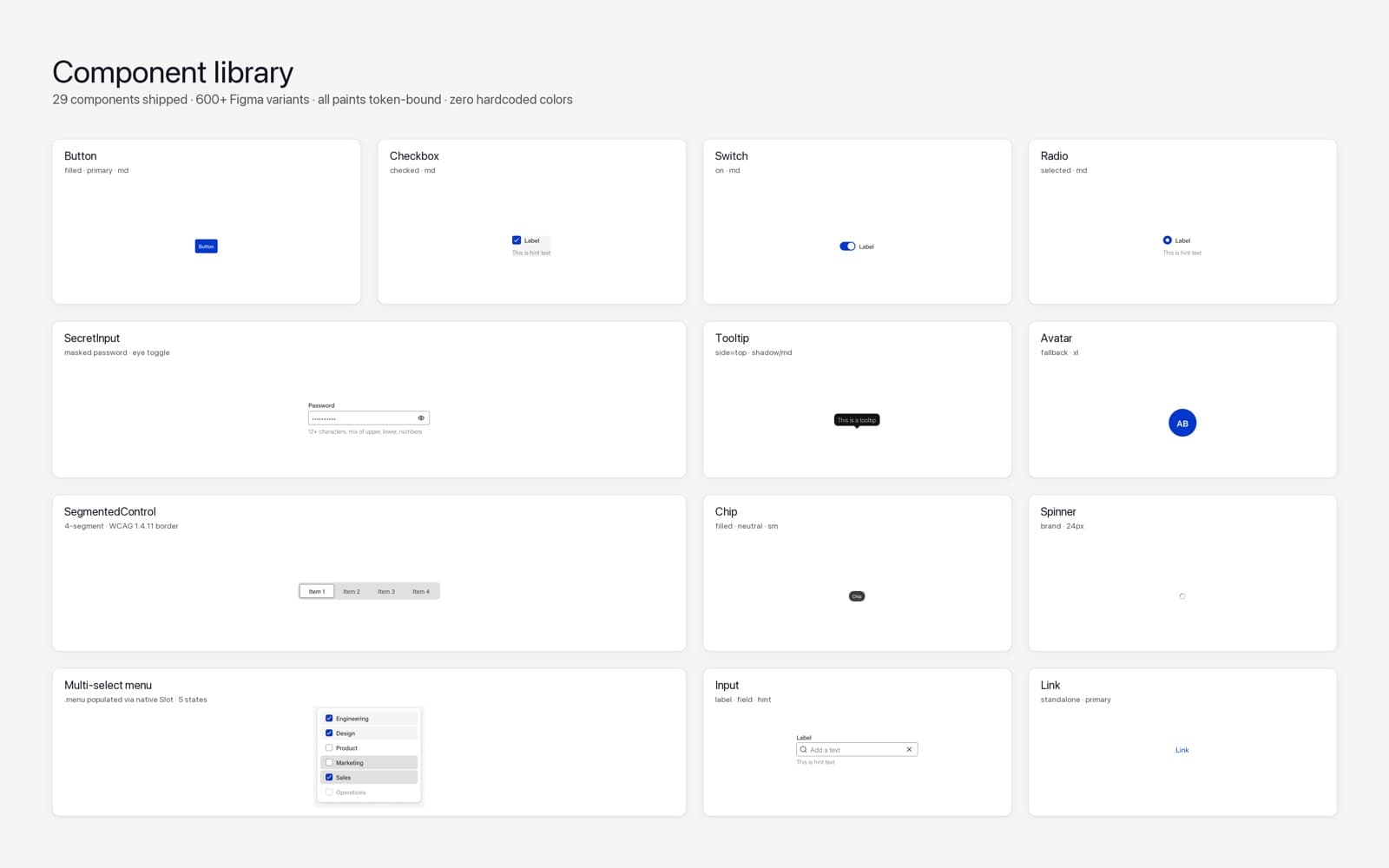
Component library — eclectic grid pulled live from the Figma file. Every paint bound to a semantic token. - 05
Figma plugin (toolkit)
22 commands shipped: token scaffold (syncs JSON to Figma variables), component annotation generator (auto-pin tokens to Figma anatomy), dark-mode audit generator (one-click variants-rendered-in-dark section), token sweep-orphans, rebind-hierarchical, copy-selection-link, variant filter, settings.
Evidence · apps/[plugin]/src/code.ts case handlers for 22 distinct commands. Scripts/server for hot-reload. Build via esbuild.
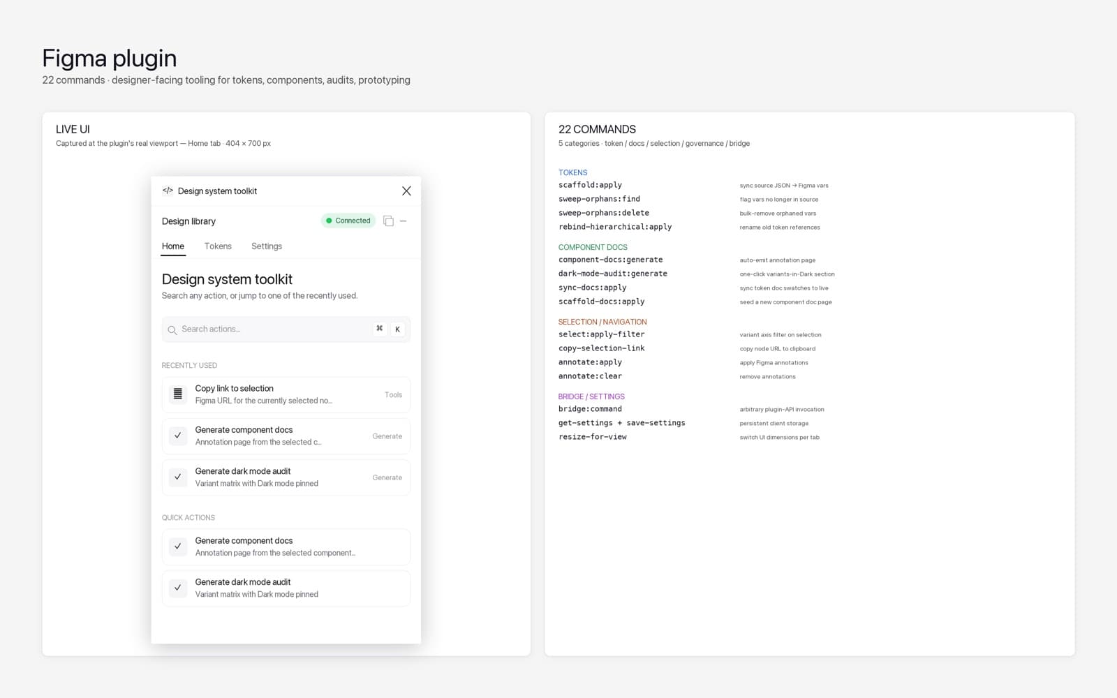
Figma toolkit — 22 commands. Token scaffold, annotation, dark-mode audit, variant filter, sweep-orphans, rebind-hierarchical. - 06
MCP server
17 tools across 5 categories so IDE agents + AI assistants query the design system the same way humans do: 4 component queries, 3 spec tools, 6 token tools, 3 validation tools, 1 audit tool. Runs via npx — one config line in the IDE and the assistant has the whole DS surface area.
Evidence · apps/[mcp]/src/tools/ with 5 tool files (audit.ts, components.ts, spec.ts, tokens.ts, validate.ts). Package shipped at @[org]/ds-mcp with bin entry. README documents tool surface for both human and agent consumers.
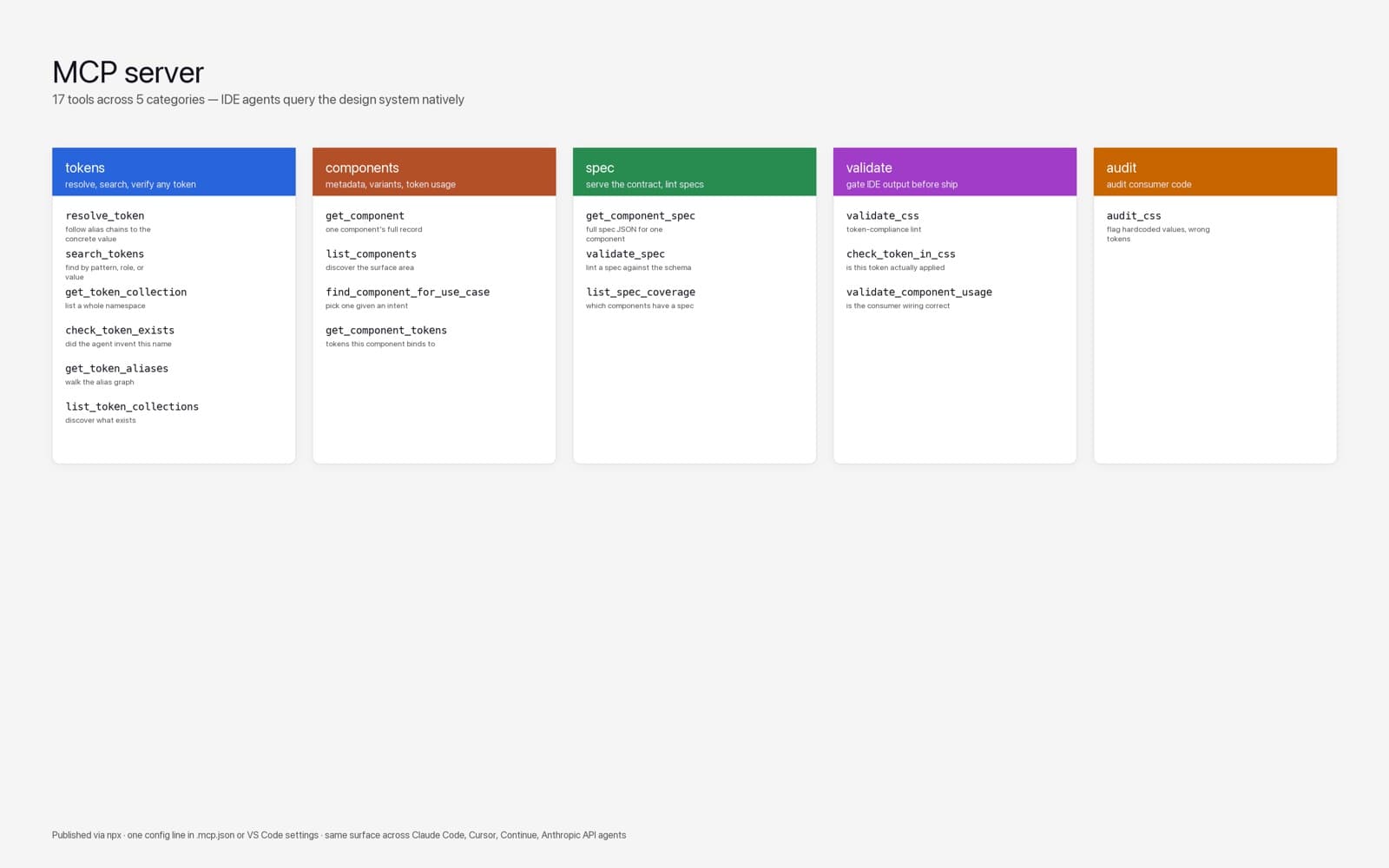
MCP server — 17 tools across 5 categories. One config line per IDE. - 07
Governance + Dark mode
20 ADRs covering every architecturally-significant decision (color naming, slot naming, component tokens, package boundaries, density-as-system-mode, dark mode strategy). Dark mode shipped end-to-end as a 3-phase initiative: audit 19 components for hardcoded colors (zero violations after the token discipline), design WCAG-verified Dark palette as primitive re-aliases (no new primitives needed), implement Dark mode in Figma via variables modes + verify per-component.
Evidence · docs/decisions/0001 through 0020 + README + template. Dark mode proposal doc 200+ lines. WCAG audits inline in spec JSON.
Outcomes
- 29 components shipped end-to-end (spec + Figma + code wiring) in ~3 weeks — averaging 1.4 components/working-day including all token/governance work.
- Zero hardcoded colors across all 29 components — Dark Mode Phase 1 audit found 0 violations. Dark mode became a token-layer change instead of 29 per-component redesigns.
- WCAG 1.4.11 gaps identified + resolved without retrofitting: introduced 2 new semantic tokens when audit showed existing ones failed against bg/muted surfaces (1.32:1 Light vs the 3:1 threshold).
- Tier 0 + Tier 1 complete (foundation primitives + all interactive atoms). 6 components in active PR queue at the time of this snapshot.
- Spec layer let me unlock 8 downstream Tier 2 menu-family components (Select, MultiSelect, Combobox, DropdownMenu, ContextMenu, Popover, HoverCard, Menubar) by shipping 3 hidden atoms — turned 8 from-scratch component builds into composition exercises.
- MCP server reduced agent context cost — an LLM querying the DS no longer needs to read every spec file; it calls get_component_spec(name) and gets validated JSON.
- Three deferred components (Slider, Toggle, ToggleGroup) — caught via the same audit pass that proved they're in code but designers had never built them in Figma. Documented as "build when a real use case lands."
Key Decisions
5 architectural decisions, and the reasoning behind each.
Spec JSON is the source of truth, not Figma. Figma + code are both adapters.
Design and engineering ship in parallel — neither side waits. The AI agent gets a queryable contract instead of guessing component APIs. The cost is one extra file per component. Worth it every time.
Hidden atoms (leading-dot Figma names like .input, .menu, .menu-item) for shared scaffolding.
One .input atom powers 5+ molecules without duplicating the form-border treatment. A change to .input propagates to every form-shaped component automatically. Edit once, ripple everywhere intended.
Add tokens only when WCAG fails an existing one, not preemptively.
Your token graph stays small and load-bearing. No 1,000-token system where 800 are never used. Audit-driven addition keeps the surface area honest and the system maintainable by one person.
Build the Figma plugin and MCP server BEFORE the components.
Building 29 components by hand means running the same decisions 29 times. With the tooling built first, every subsequent component gets generated, audited, and documented automatically — the investment pays for itself long before the library is finished.
Defer components rather than build for completeness.
Slider + Toggle + ToggleGroup exist in code but designers never built them in Figma — shipping them anyway would consume review bandwidth a real component needs. Documented as deferred with a clear "build when used" trigger. Your roadmap stays grounded in actual demand, not spec-completionism.
What this proves
I don't ship component libraries. I ship the production line that ships component libraries.
The monorepo layout, the governance stack, the tooling layer, and the spec-driven workflow all carried over from previous builds, so almost none of the setup had to be invented here.
The foundation reached production-ready: every component traceable to a token, AI agents querying the system natively, and a governance model documented well enough that the team kept shipping against it without me in the loop.