Case study · Early-stage product team
A Figma variable system where theme, brand, and density compose instead of multiplying.
An AI-readiness audit of two Figma libraries turned into a rebuild of the thing underneath them: 599 variables across six collections, three independent mode dimensions, a library refactored to match, and the plugin tooling to scaffold it rather than click it.
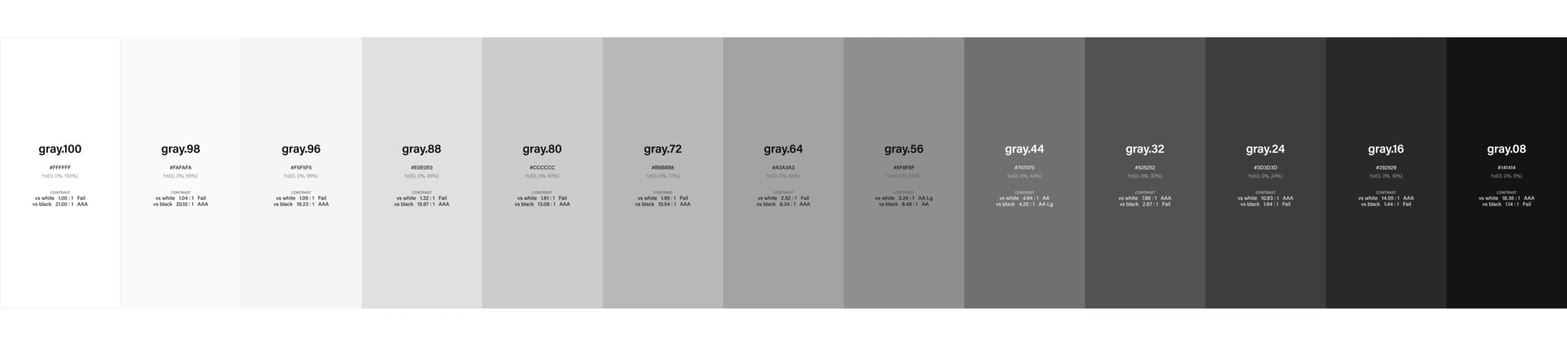
- Figma Variables
- Library Architecture
- Design Tokens
- Variant Architecture
- Figma Plugin
- MCP / AI tooling
- Design System Audit
- Design/Code Parity
The problem you’re reading about
The team had a design system that looked healthy from the inside. Two Figma libraries, a coded component library, a token taxonomy, documentation. Internally consistent enough that nobody had a reason to question it.
The question they were actually asking was different: could this system drive AI-assisted design and code generation? That is a much harder bar than internal consistency. An assistant generating UI can't infer intent from a component's name, or from a designer's memory of why something was built that way. It can only use what the system makes explicit. Anywhere the structure is implicit, the assistant guesses, and the guesses look plausible enough to ship.
So the audit tested for something most design system reviews don't: whether the system could function as deterministic infrastructure. Not whether it was tidy — whether it was unambiguous.
Approach
Week one was diagnosis against an eight-pillar model: token taxonomy, Figma library architecture, component API alignment, typography and responsive behavior, design/code parity, documentation, accessibility and governance, and AI/MCP readiness. Each scored 1–5, and each paired with the specific failure it would cause rather than a grade in isolation.
The drift between Figma and code was captured side by side, and the risk areas were written as scenarios — the specific generations where an assistant would produce inconsistent output, and why. That reframes an audit from a report card into a list of things that will break, which is what makes it actionable.
The finding was that the system needed structural work before any AI workflow could be trusted on top of it. So weeks two and three became implementation rather than a roadmap handoff.
Build
8 phases. Each one is a discrete deliverable that ships before the next starts — token foundation first, then the system makes everything above it possible.
- 01
Audit
Eight pillars reviewed across two Figma libraries, the coded component library, the existing token taxonomy, component APIs and usage patterns, documentation, and implementation patterns. Delivered as a scored scorecard, per-pillar FigJam boards, a Figma-to-code drift map, a quick-wins list with effort estimates, and a 30/60/90 roadmap — presented to the VP of Design and senior stakeholders.
The eight-pillar model, written out in full(opens in a new tab)
- 02
Primitives and semantic tiers
Rebuilt the taxonomy on a W3C-style structure: 258 primitives holding raw values, and semantic collections that reference them rather than restating them. Nothing in the semantic layer carries a literal — a semantic entry's value is a pointer at a primitive, so the raw values live in exactly one place. Naming conventions and ownership rules were set at the same time, so the tiers stay meaningful instead of collapsing back into a flat list.
Evidence · 599 variables across six collections — Primitives 258, Semantic/Colors 186, Semantic/Core 64, Semantic/Typography 56, Density 21, Brand 14.
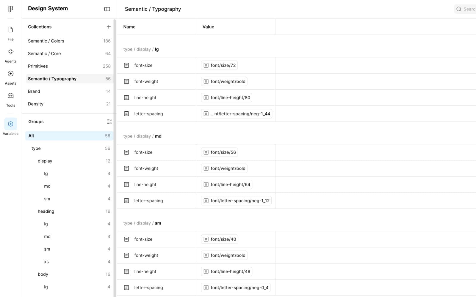
The semantic layer holds no raw values. Every entry resolves through a primitive — so the type scale is defined once and referenced everywhere. - 03
Light and dark as modes
Theme lives as modes on the semantic collections rather than as a parallel set of tokens. A component binds to a semantic role once; the mode decides what that role resolves to. The switch from light to dark is a mode change on the collection, not a second set of components or a fork of the library.
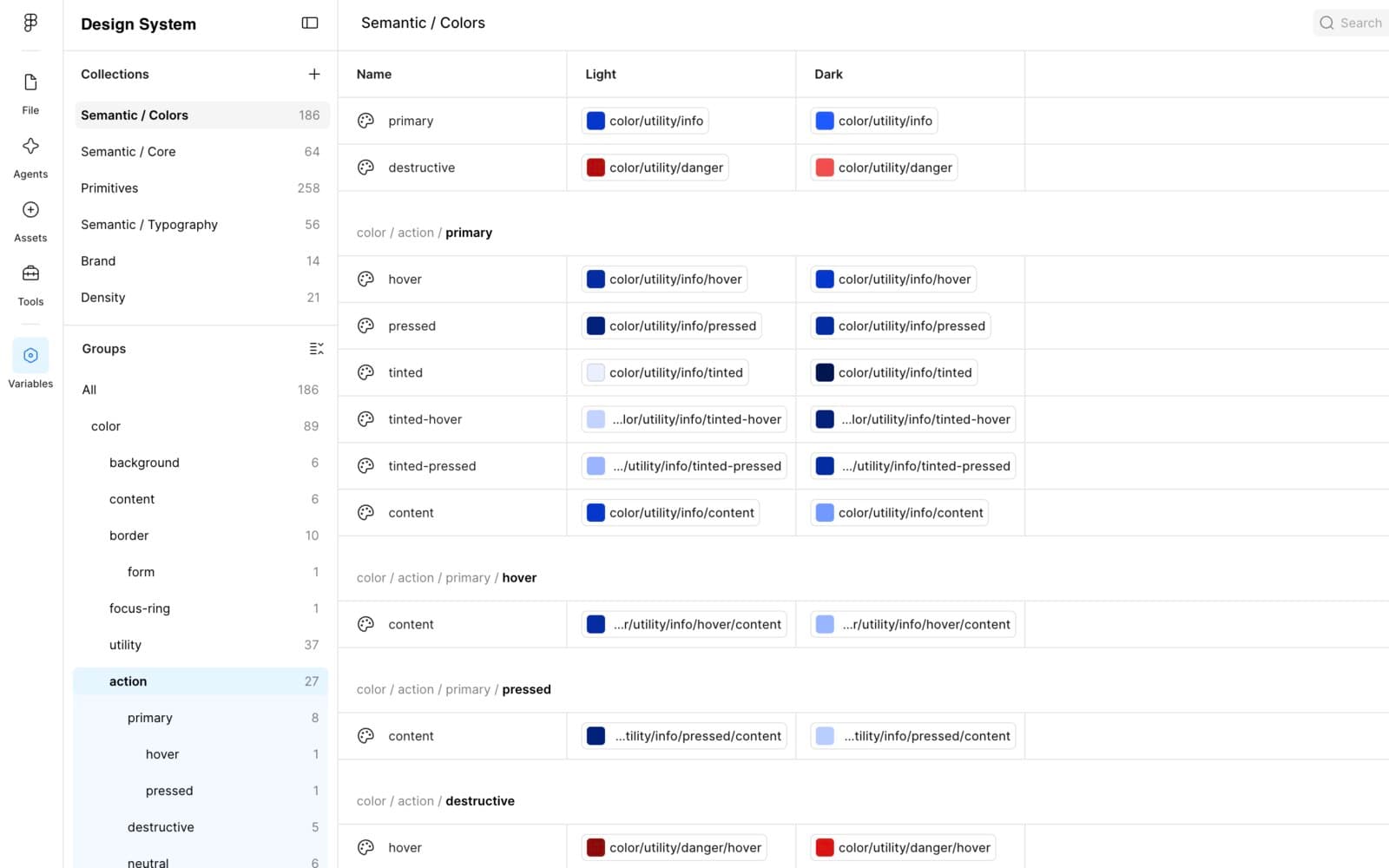
Light and Dark as mode columns on one collection. Interaction states resolve per mode, so a component bound to color/action/primary is already correct in both. - 04
Brand as a second dimension
Three brands supported as modes on their own collection rather than as three libraries. Each brand supplies its own ramp; everything above it is untouched. Adding a brand is a column rather than a fork, which is the difference between a multi-brand system and three systems that happen to share a designer.
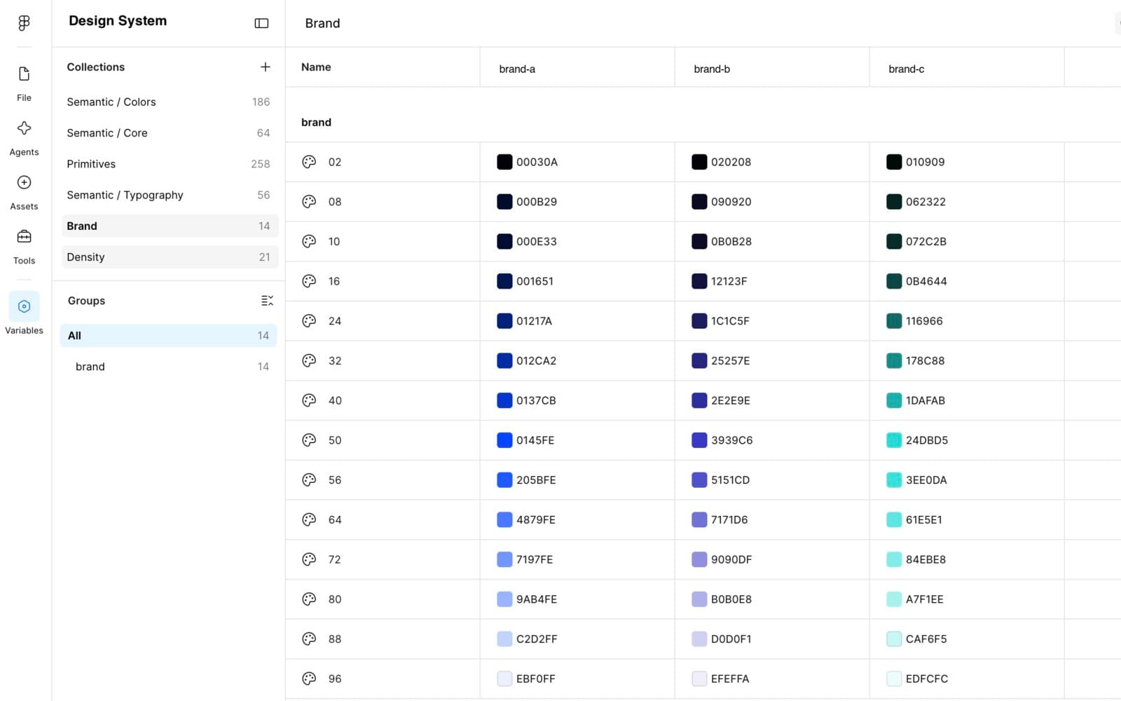
Three brands as mode columns on one collection, each a ramp at matched lightness steps. Brand names redacted. - 05
Density as a third dimension
Density is the axis most systems handle by duplicating components at different sizes. Here it's a mode: comfortable and dense each map the same named steps onto different primitives, so a table cell asking for height/md gets 48px in comfortable and 40px in dense without knowing which mode it's in. The component never branches on density at all; the variable resolves it.
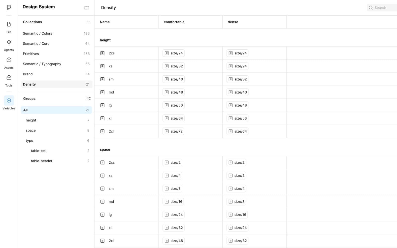
Density as a mode, not a component variant. The same named step resolves to a different size primitive per mode — height/md is size/48 comfortable, size/40 dense. - 06
Library refactor
Reworked the Figma library against the new taxonomy: variant axes reorganized to map onto the coded component APIs, redundant components eliminated, overlapping patterns consolidated. Every fill bound to a semantic variable rather than a literal, which is what lets one component set carry every theme, brand, and density combination instead of multiplying into separate sets.
Evidence · Button: a 9 × 18 matrix — three styles (filled, ghost, outline) × three intents (primary, neutral, destructive), across three sizes and six states including focus-visible, disabled, and loading.
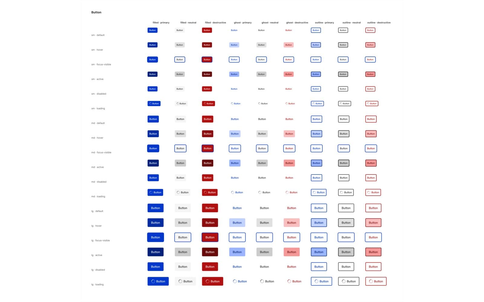
One component set covering every style × intent × size × state combination, with each fill bound to a semantic variable rather than a literal. - 07
Documentation and accessibility
Each component documented in-file with its accessibility contract: the roles and ARIA attributes it renders, keyboard behavior, focus and contrast requirements, and the specific WCAG success criteria it has to satisfy. Written next to the component rather than in a separate site, so the contract is where the person using the component already is.
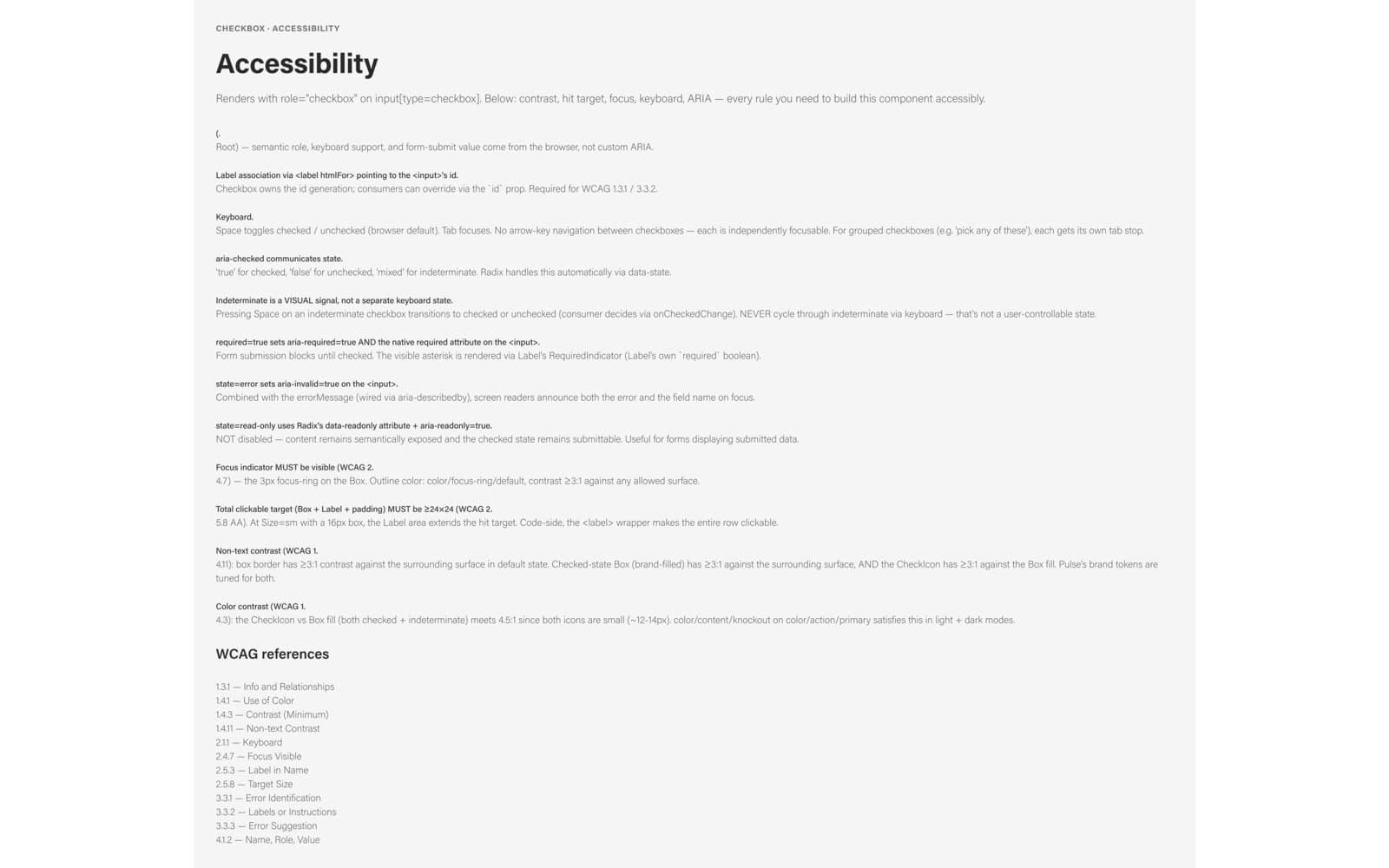
The accessibility contract documented in-file, per component, mapped to specific WCAG criteria rather than a general commitment. - 08
Plugin bridge and generated artifacts
Built a Figma plugin bridging the file to Console MCP — scaffolding variables programmatically, emitting the token pipeline output, and carrying helper utilities for the maintenance work that otherwise happens by hand. Building 599 variables across six collections and three mode dimensions by clicking is where this kind of project stalls; generating them made the structure reproducible and cheap to revise. With that in place, documentation, component proposals, and stakeholder artifacts were generated against the system's contracts rather than free-form.
Outcomes
- 599 variables across six collections, with the semantic layer holding no literal values — every entry resolves through a primitive, so raw values exist in exactly one place.
- Three independent mode dimensions on one system: theme (light/dark), brand (three), and density (comfortable/dense). They compose, so a dense dark screen in the third brand needs no additional components.
- Density moved out of components and into variables — the same named step resolves to a different size primitive per mode, so components stop branching on it.
- Component sets refactored so variant axes map onto the coded component APIs, with every fill bound to a semantic variable rather than a literal.
- Accessibility contracts documented in-file per component — roles, ARIA, keyboard behavior, focus and contrast requirements, each mapped to specific WCAG criteria.
- An eight-pillar readiness assessment with the Figma-to-code drift mapped explicitly, and AI risk areas written as concrete failure scenarios rather than general warnings.
- A Figma plugin bridging the library to Console MCP — variables scaffolded programmatically rather than by hand, token pipeline output emitted, maintenance utilities included.
- All of it in a single engagement, audit through implementation.
Key Decisions
5 architectural decisions, and the reasoning behind each.
Audit for whether the system is unambiguous, not whether it's consistent.
Consistency is a human standard that tolerates conventions people carry in their heads. A system driving generation has to be explicit, or the assistant fills the gaps with plausible guesses. Testing for ambiguity surfaces failures that stay invisible until tooling sits on top of the system.
Mode, brand, and density as dimensions of one variable system — not separate libraries.
Duplicated libraries drift the moment one gets a fix the others don't. Composable dimensions mean a new brand or a density change is a variable-level addition, not a parallel library someone has to keep in sync by hand.
Name Figma variant axes to match the coded component API.
Design/code parity stops being a recurring review task and becomes structural. It also means an assistant reading either side gets the same vocabulary, so generated code matches the design without a translation layer in between.
Scaffold the variable structure programmatically instead of by hand.
A taxonomy of this shape is thousands of clicks to build manually, and manual builds are where the inconsistencies enter. Generating it makes the structure reproducible, reviewable, and cheap to revise when the taxonomy changes.
Ground every AI-generated artifact in the system's contracts.
Documentation generated from the system's own contracts stays accurate as the system changes. Free-form generation produces documentation that reads well and quietly disagrees with the code, which costs more to discover than it saved to write.
What this proves
Most design system audits grade a system against itself. Asking instead whether the structure was explicit enough to generate from turned up a different set of problems, and those were the ones worth rebuilding for.
The variable architecture is the load-bearing part. Everything downstream — the token pipeline, the plugin, the generated documentation — depends on theme, brand, and density being dimensions of one system rather than three copies of it.