Case study
Scaling Design Infrastructure Across 48 Brands
Orchestrated the rebuild of a multi-brand design system from the ground up—driving cross-org alignment, implementing token architecture, and embedding Figma Variables for automated theming and live design-code sync.
On this page
Executive Summary
I architected and led the transformation of Hearst’s 48-brand product ecosystem—from a fragmented patchwork of UI kits into a centralized, scalable design system platform. This initiative overhauled token infrastructure, automated theming across brands, and established live Figma-code parity through REST-powered sync. The result: a 80% reduction in brand theming time, elimination of manual overrides and detachment, and a unified design foundation embraced by engineering, product, and leadership.
The Cost of Inconsistency
When every team solves the same problem 48 different ways, systems break.
At Hearst, each brand had evolved its own pattern for basic UI elements—buttons, inputs, modals, navs. Designers regularly detached components to apply custom brand styling, leading to mismatches, redundancy, and bugs. The search experience was a perfect example of this fragmentation in action.
Legacy System Failure: Search Input Inconsistency
Across brands, search UI had become a patchwork of misaligned components, overrides, and accessibility issues.
- On the legacy Search Results Page, input fields appeared visually inconsistent—with padding, size, and alignment misaligned between instances. Some inputs were built from scratch, others hacked together with overrides or outdated components.
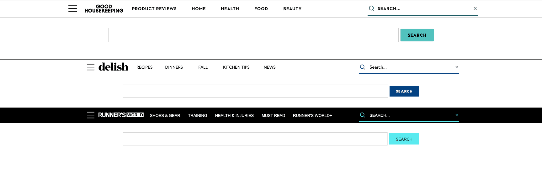
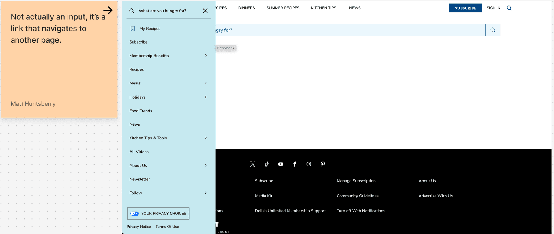
- In the Left Navigation, a search input appeared in the sidebar, but it wasn’t actually a form field. It was a link disguised to look like an input. This broke expected behavior for users, especially those relying on screen readers or keyboard navigation.
This disconnect wasn’t just cosmetic—it was structural. It created friction for users, ambiguity for engineers, and distrust across product teams. Stakeholders couldn’t rely on components to behave predictably, and accessibility compliance was nearly impossible to audit or enforce.
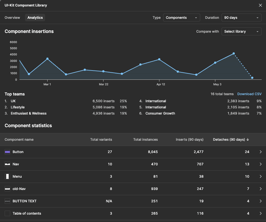
Quantifying the Breakdown
We tracked Figma component detachment across all brands using the Figma REST API. Usage data revealed a steep decay curve, with core components being detached in over 75% of instances.
Why This Mattered
- Lost Efficiency: Teams spent hours redesigning and restyling the same patterns over and over again.
- Increased QA Churn: Inconsistency created downstream bugs and additional review cycles.
- Eroded Trust: When components didn’t behave as expected, teams reverted to custom solutions.
- Accessibility Risk: Misleading semantics (like the fake search input) created real WCAG violations.
- No Source of Truth: Without token governance or theme automation, overrides were the norm.
This wasn’t a tooling problem—it was a systems failure. To scale, we had to rebuild trust at the component level and treat consistency as infrastructure, not an afterthought.
Driving the Vision and Leading Execution
I defined the design system strategy and pitched it directly to the SVP of Product and Technology—framing it not as a UI cleanup, but as a cross-org infrastructure shift. I designed the token architecture and theming model from the ground up, ensuring it could scale across 48+ brands with zero detachment. From there, I led execution across product design, engineering, and brand teams—aligning design tokens, components, and documentation under a single system of record.
Rebuilding for Scale, Alignment, and Speed
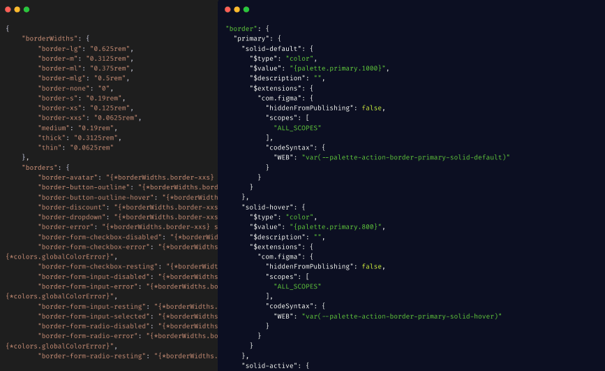
I architected a new token infrastructure built on primitives, semantic aliases, and mode-aware brand themes. Every foundation decision was designed to support scale—enabling 48+ brands to adopt consistent tokens while preserving their unique identity. Tokens were mapped to brand themes and exported across CSS variables, JavaScript constants, and design tooling using Style Dictionary. This gave designers and engineers a single source of truth—fully synced across Figma, Storybook, and code.
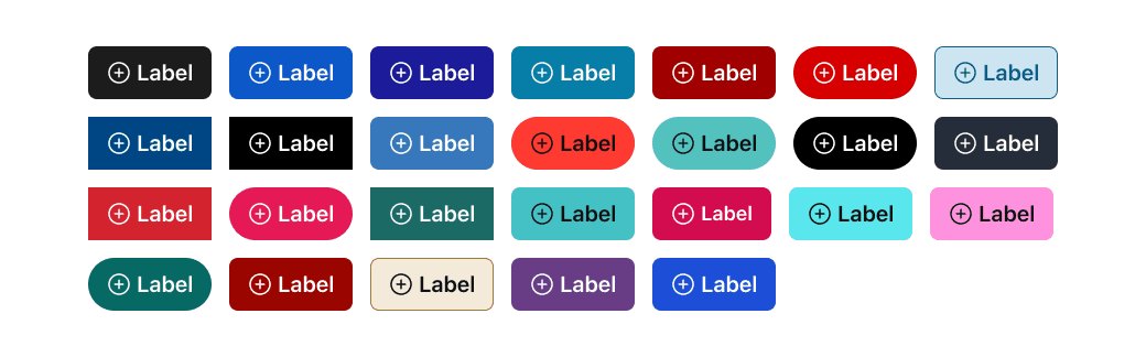
Figma Variables Integration
Multi Theming using Figma Variables
I implemented a programmatic theming system using Figma Variables and REST API automation—eliminating manual overrides, detachment, and inconsistency. Every brand could now switch themes live, with mode-aware tokens applied globally across component libraries. This automation ensured real-time parity between code and design, allowing teams to preview tokens in context without touching the base system.
Component System Rebuild
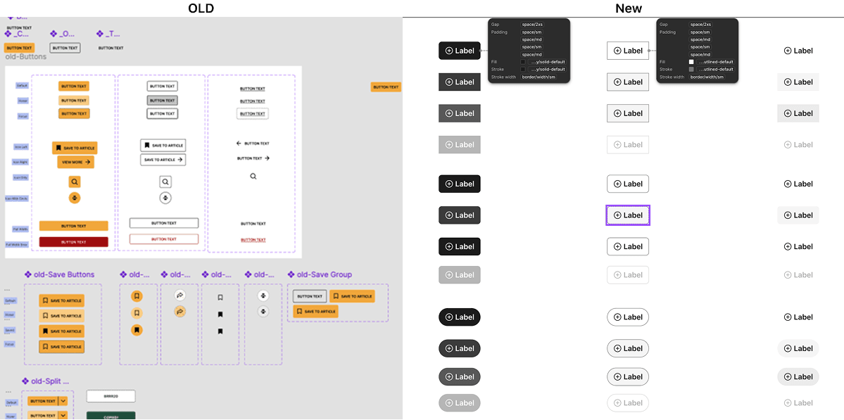
I rebuilt the component system from the ground up—eliminating redundant patterns and aligning all variants to a shared, token-driven architecture. Each component was made mode-aware and brand-flexible, with design tokens powering variants in both Figma and Storybook. This created true design–dev parity, drastically reduced QA churn, and gave teams the confidence to scale without fear of drift or duplication.
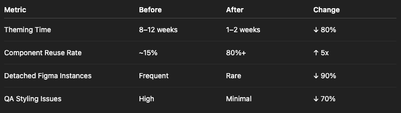
Transformative Results Across the Org
What I Learned and What’s Next
A successful design system isn’t just built—it’s adopted. That requires more than architecture. It requires training, trust, and shared language. I learned that onboarding and education must evolve in lockstep with system maturity.
This work also made one thing clear: design systems are product infrastructure. Not UI kits. Not libraries. Real infrastructure that drives velocity, quality, and alignment.
My next focus is scaling system intelligence—through analytics dashboards, adoption tracking, and platform health tooling that closes the loop between design, code, and leadership visibility.
This work taught me that system maturity isn’t just technical—it’s cultural. If I were to do it again, I’d pair infra rollout with a role-specific onboarding plan for designers, engineers, and PMs.