Case study · Government technology platform
One token source feeding two component runtimes that never disagree.
I architected this design system platform end-to-end for a government technology client — tokens, framework-agnostic web components plus React, AI context infrastructure, and the CI and governance that keep the two runtimes honest.
- Design Systems
- Design Tokens
- Style Dictionary
- Web Components
- React
- MCP / AI tooling
- Storybook
- Nx monorepo
- WCAG / Accessibility
- Figma plugin
The problem you’re reading about
You're on this page because something on your team is stuck.
Maybe your design system is React-only, and the rest of your stack — Vue, Angular, Svelte, an embedded surface, a legacy app — is locked out. Maybe a brand or theme refresh is on the horizon and your colors are hardcoded into a hundred component files. Maybe AI assistants in your dev workflow are inventing component APIs and off-system tokens because nothing feeds them the real source.
Maybe you have what people call a "component library" but no machine-readable description of it — so the docs site, the AI tooling, and the team's mental model all drift the moment someone ships.
These are the same problems this client had. The rest of this page is what fixing them looks like end-to-end, and what it costs to get there.
Approach
Build the platform as layers in one Nx monorepo, designed so it serves multiple apps across multiple frameworks under strict accessibility requirements — without requiring proportional headcount as adoption grows.
The load-bearing decision is what sits at the bottom. Framework-agnostic web components are the source-of-truth runtime and React is a thin consumer on top, so the component layer isn't hostage to one framework's lifecycle. Above that, everything the team and its tooling read — docs, AI context, audits — is generated from the components rather than maintained alongside them.
That generation step is what keeps the system honest at scale: there is no second description of the system that can quietly fall out of date, because there is no second description at all.
Build
5 phases. Each one is a discrete deliverable that ships before the next starts — token foundation first, then the system makes everything above it possible.
- 01
Token foundation
Single token source compiled to CSS variables and per-mode themes via Style Dictionary. ~698 tokens across ~18 foundational categories (color, spacing, radius, type, elevation) and 20 component-scoped groups. Light + dark themed without touching a single component. A brand or theme refresh is a token PR; component files don't move.
Evidence · ~698 tokens across ~18 foundational categories + 20 component-scoped groups. Style Dictionary build emits CSS custom properties and per-mode themes from one source.
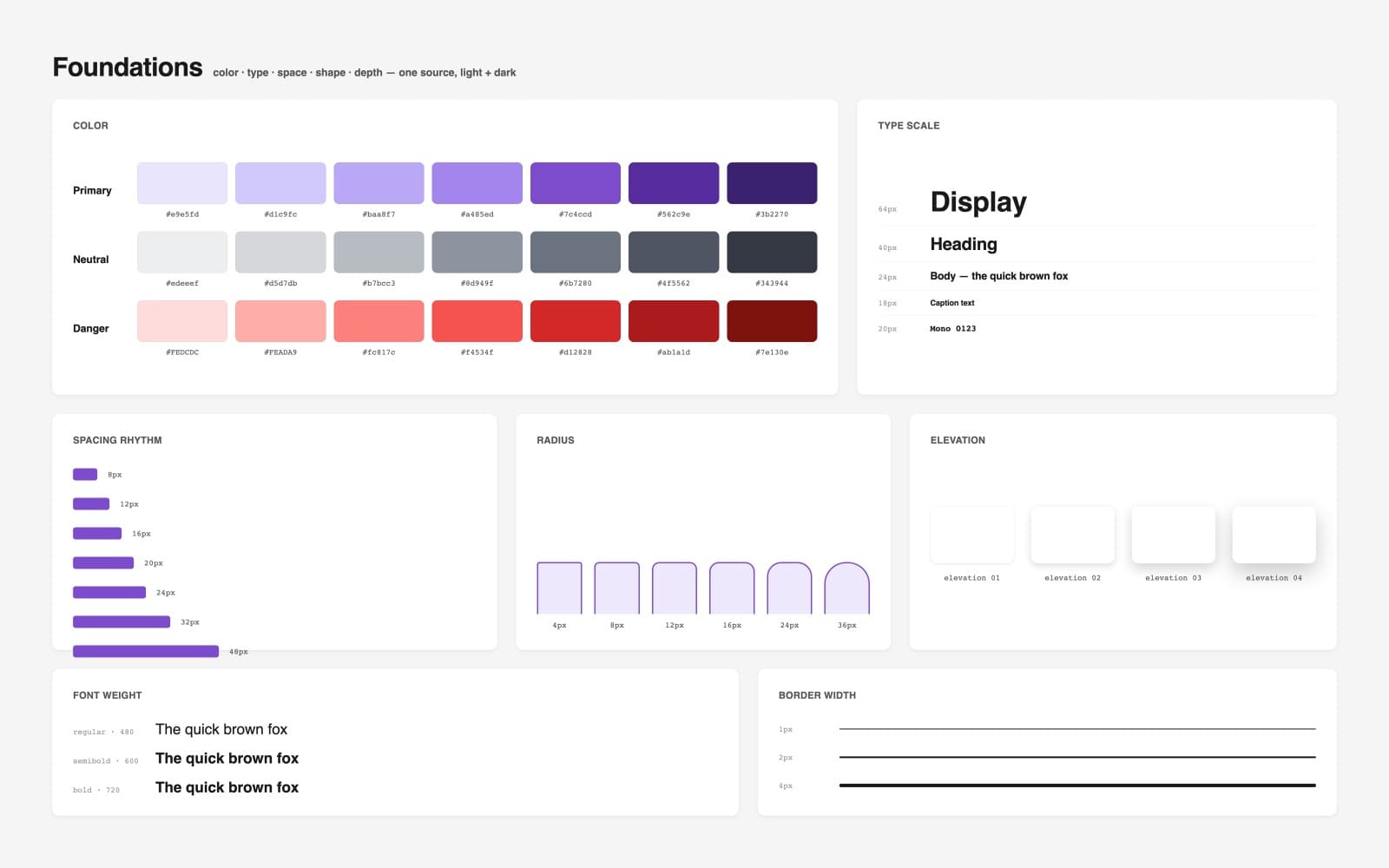
Token language — ~698 tokens across color roles, an 11-step spacing scale, a 12-step type scale, 7 radius steps, font weights, border widths, and a 5-step elevation scale; one source, light + dark. - 02
Dual component runtime
23 framework-agnostic Lit web components as the base layer, 40 React components on top. Both consume the same token CSS. The web components drop into Vue, Angular, Svelte, or plain HTML — the React layer is a thin consumer for teams already on React. One component layer serves every framework.
Evidence · 63 components total across two runtimes, published as separate packages (@[client]/[ds]-wc, @[client]/[ds]-react) off one token source. Both Storybooks deploy to a single public docs site.
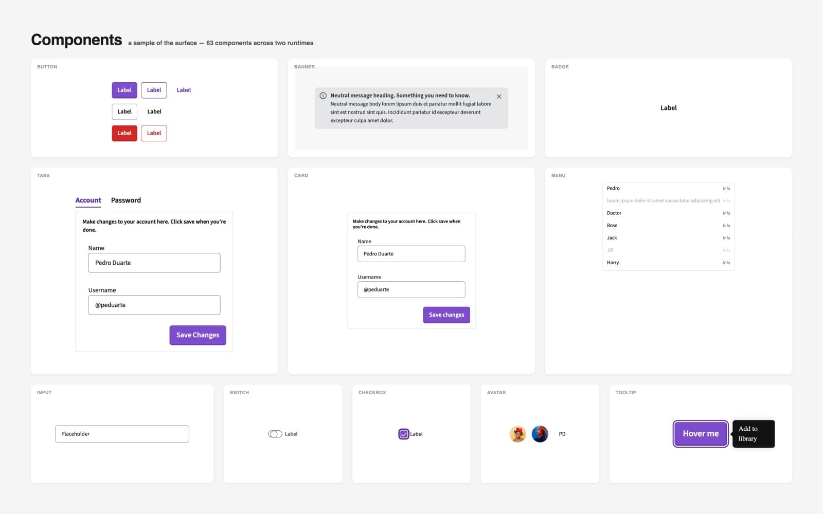
A sample of the surface — 63 components across two runtimes, every paint resolved through the shared token layer. - 03
Machine-readable API
Custom Elements Manifest auto-generated on every build (npx cem analyze runs in the wc build target). Docs and AI tooling read the generated truth — there's no separate documentation layer that can go stale. When the component changes, the manifest changes; nothing else needs maintenance.
Evidence · Manifest generation wired into the web-components build target, so it cannot be skipped or forgotten. Docs site and MCP server both consume the generated manifest rather than hand-written descriptions.
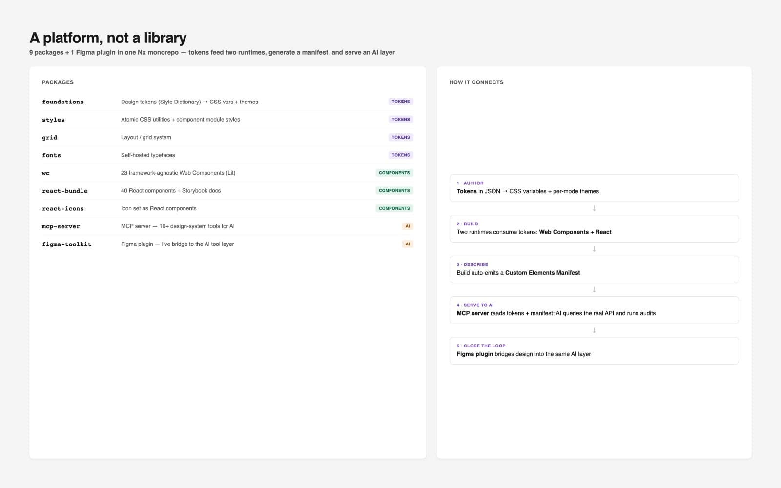
A platform, not a library — 9 packages + 1 Figma plugin in one Nx monorepo. Tokens feed two runtimes, the build emits a manifest, and the AI layer reads both. - 04
AI context layer (MCP + plugin)
Local MCP server exposing the real system to AI assistants — component discovery, token resolution, contrast checking, alignment scoring, typography and a11y auditing, and off-system component replacement. Runs over stdio, zero ops, no API key, no LLM calls of its own. Any consumer reproduces the AI layer by cloning the repo. A Figma plugin bridges design back into the same tool layer over WebSocket.
Evidence · 14 tools published in the MCP catalog across components, tokens, audits, and migration. Server runs locally over stdio and reads bundled design-system data only — any tool use bills to the caller's AI session, never the publisher's.
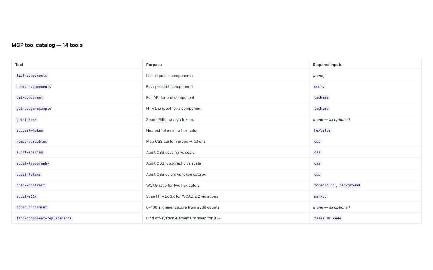
The MCP tool surface — 14 tools that let an AI assistant build with the real system instead of guessing at it. - 05
Delivery + governance
5 GitHub Actions workflows: test suite, release-version, release-all-packages, test-release-build, Storybook deploy. Nx release with git-tag versioning + npm publish. Both Storybooks (React + Web Components) consolidated to one GitHub Pages site via a combined deploy I built. Storybook a11y addon plus ~155 files referencing wcag/aria/a11y. WCAG AA/AAA contrast checking shipped as an MCP tool.
Evidence · 5 workflows, Nx release with git-tag versioning + npm publish, one consolidated docs site (landing + /react-bundle + /wc), and an onboarding path that takes a designer or engineer from zero to building against the system.
Outcomes
- Nx monorepo shipping 9 packages + 1 Figma plugin — tokens → components (web + React) → MCP server → Figma plugin → CI. Every package versions and releases independently.
- 63 components live: 23 framework-agnostic web components and 40 React components, both consuming the same token source.
- 14 MCP tools queryable from any Claude Code session over stdio — component discovery, token lookup, contrast checking, alignment scoring, a11y auditing, and off-system component replacement.
- React + Web Component Storybooks deployed to a single public docs site (landing + /react-bundle + /wc) in one combined deploy I built, alongside onboarding, npm-access, and Figma-connection guides.
- Accessibility built in, not bolted on: Storybook a11y addon, ~155 files with a11y/wcag/aria references, and WCAG AA/AAA contrast checking shipped as a tool the AI layer can call.
- Releases automated end-to-end across 5 GitHub Actions workflows, with Nx release handling git-tag versioning and npm publish.
Key Decisions
5 architectural decisions, and the reasoning behind each.
Tokens reference semantic roles, not raw values — a brand or theme refresh re-points tokens and every component follows.
Re-theming is a token PR, not a component sweep. Mid-project rebrands stop being existential. Dark mode is a token addition, not a per-component redesign.
Web Components as the source-of-truth runtime, React as a thin consumer layer on top.
One component layer serves any framework or surface. You don't lock yourself out of Vue, Angular, Svelte, or whatever's next when team composition shifts.
Auto-emit the Custom Elements Manifest on every build — docs and AI context read generated truth.
Documentation can't silently drift from code. You don't need a docs maintainer or a quarterly "docs audit" — the manifest is the source, regenerated automatically.
MCP server runs locally over stdio, resolves data relative to the repo.
Zero hosting cost. Zero ops. Any consumer reproduces the AI layer by cloning. The AI context layer is portable across teams, not a centralized dependency.
Alignment audits emit {total, matched, nearMatched} counts that roll into one 0–100 score.
Governance becomes a number a PM can read, not a subjective design review. System health stops requiring an interpreter — the score speaks for itself.
What this proves
A design system doesn't have to pick a framework. Putting the framework-agnostic runtime at the bottom and treating React as a consumer means the platform outlives whatever the team is hiring for this year.
It also doesn't have to pick between documentation and velocity. Generating the manifest on every build removes the maintenance tax that usually makes docs the first thing to rot — and it's the same move that makes the system legible to AI assistants, which is why the MCP layer cost days rather than months.
And it scales without headcount tracking adoption. The manifest, the audits, and the alignment score are machine-readable by construction, so system health is a number the team can read rather than a review someone has to schedule. That is what keeps a 63-component platform across two runtimes coherent without a proportionally larger team behind it.