Case study
Turning Assumptions Into Insights
I built a design-system dashboard that tracked adoption, coverage, detachment, and overrides, then used those insights to drive prioritization, governance, and measurable outcomes.
On this page
Summary
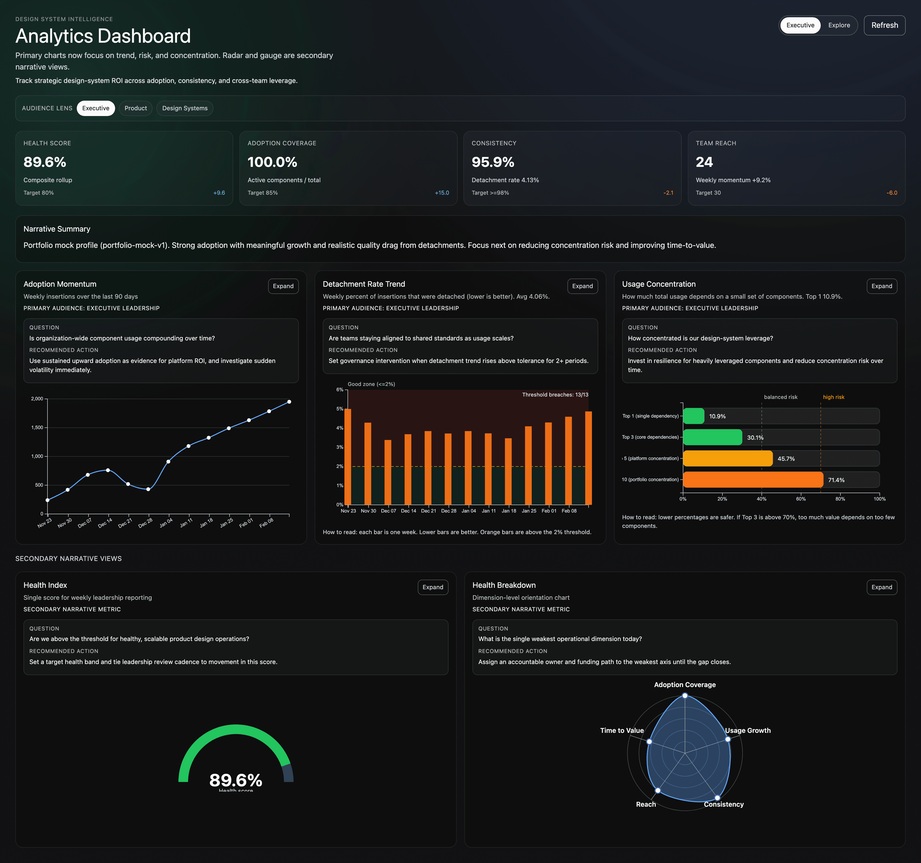
I built a system health dashboard to turn design-system feedback from opinion into evidence. The dashboard tracks adoption metrics, drift, detachment, overrides, and coverage so teams can make better roadmap and governance decisions.
Scope. I led strategy, measurement design, and prioritization across a multi-brand system serving 48 plus brands.
How We Measured System Health
The model combined Figma API events, component usage data, and weekly telemetry snapshots to produce stable trend lines instead of one-off reports.
Signal sources
- Component insertions and instance counts by team and file
- Detachment and override events as drift signals
- Coverage of system-supported patterns against shipped UI patterns
- Consistency and design-code parity checks across key components
Measurement cadence
- Weekly telemetry pull and dashboard refresh
- Bi-weekly prioritization review with design and engineering leads
- Monthly leadership readout with action owners and due dates
Metric Definitions
Timeframe and baseline
All impact metrics were tracked over 12 weeks. Baseline values were captured during the two week window before rollout.
Adoption metrics
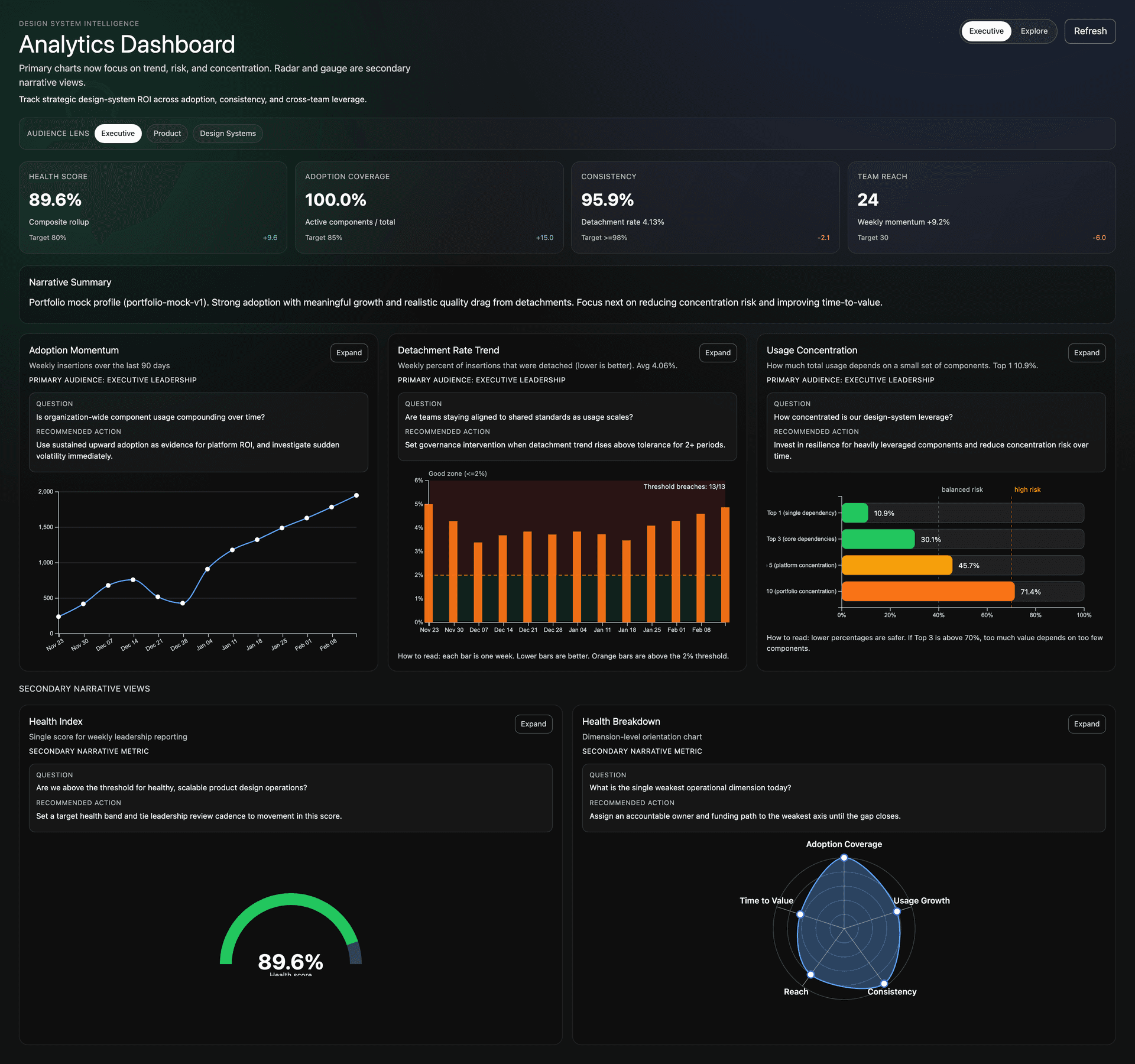
Adoption equals the share of new UI implementation using system components without one-off forks. Baseline 18 percent to 72 percent.
System health
System health is a weighted composite of adoption, consistency, coverage, and team reach.
Drift, overrides, detachment
Drift is measured through detached instances and non-approved overrides. Detachment means an instance no longer inherits source updates. Baseline detachment 31 percent to 9 percent.
Coverage
Coverage is the percent of recurring UI patterns represented by approved system components and guidance. Baseline 52 percent to 81 percent.
Top-level thresholds
- Health Score target 80 percent plus for weekly reporting
- Adoption Coverage target 85 percent plus
- Consistency target 98 percent plus
- Team Reach tracked as active teams plus weekly momentum
How the Dashboard Changed Decisions
The point was not reporting. The point was better decisions. We used the dashboard to tie governance and prioritization directly to observed behavior.
Decision loop examples
- Button drift spiked in two teams. We prioritized token binding cleanup plus design-code parity docs. Detachment dropped 34 percent in four weeks for that pattern.
- Coverage gaps showed repeated custom table patterns. We prioritized a table guidance package and reusable variants. Adoption increased in the next release cycle.
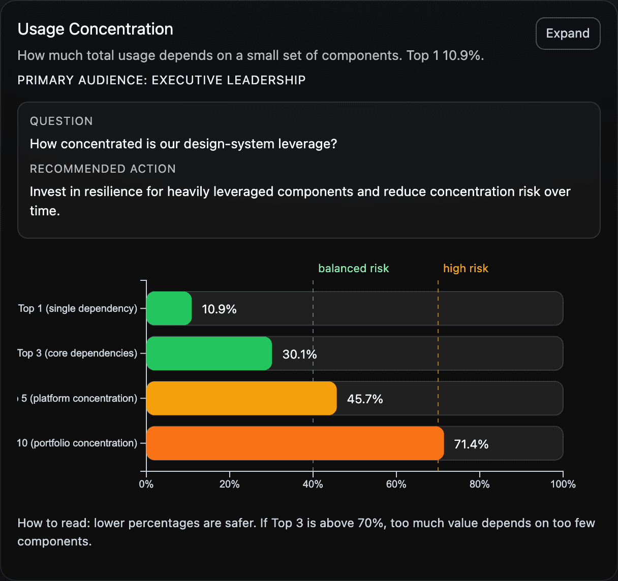
- Usage concentration showed over-reliance on a small set of components. We prioritized pattern diversification and reduced risk from single-component dependency.
Operational result
This created a repeatable cycle. Measure, prioritize, ship, and re-measure with clear owners.
Narrative-Driven Charts
Each chart answered a decision question and included an audience lens for executive, product, and design-systems stakeholders.
Adoption Momentum
- Weekly insertions over 90 days to show adoption trajectory.
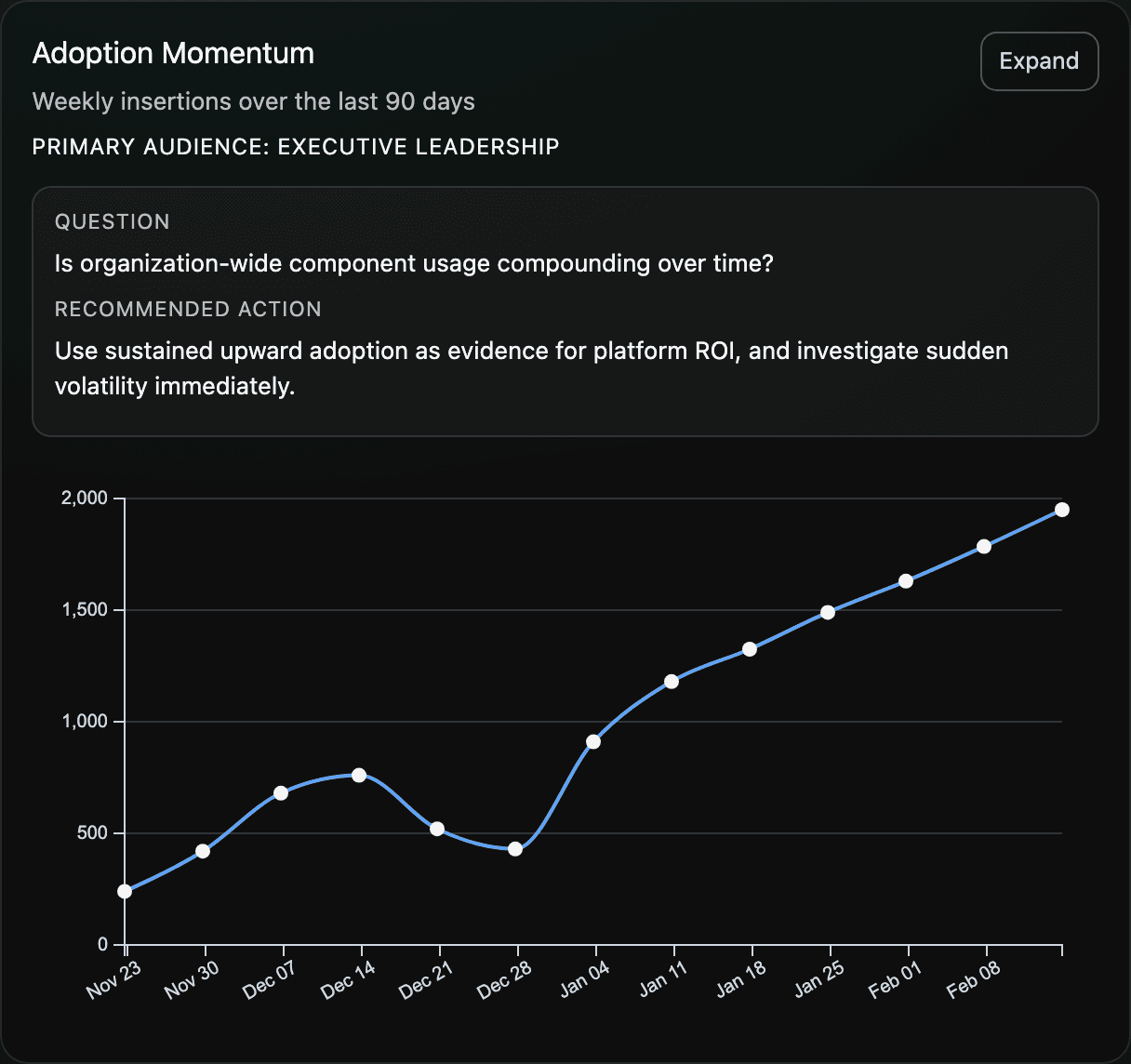
Detachment Rate Trend
- Weekly detached percentage with governance thresholds and escalation triggers.
Usage Concentration
- Top component concentration view to detect dependency risk and shape roadmap investments.
Governance, Prioritization, and Release Versioning
Dashboard insights fed directly into governance and release/versioning decisions.
How insights mapped to execution
- High-drift components moved to top roadmap priority
- Low-coverage patterns became new system backlog candidates
- Release versioning notes documented migration work and expected impact
- Owners and timelines were set in each prioritization cycle
Impact Over 12 Weeks
- 70 percent reduction in detachment. Baseline 31 percent to 9 percent.
- 4 times increase in adoption. Baseline 18 percent to 72 percent.
- Fewer support escalations tied to unclear component usage
- Faster decision-making because tradeoffs were visible
Most importantly, the dashboard shifted culture from reactive fixes to proactive system stewardship.
TLDR
This work turned design-system telemetry into operating leverage. We moved from assumptions to insights, and from insights to repeatable governance, prioritization, and measurable outcomes.