Case study
How I Lead Design Systems Teams: Feedback, Ownership, and Scaling Trust
I lead through feedback rituals, clear governance, and measurable execution. This case study combines team leadership practices with a concrete artifact pack and a full Button delivery example.
On this page
Summary
Design systems succeed through people before process. I lead through feedback rituals, clear ownership, and measurable execution. My role spans strategy and delivery across design and engineering, with a focus on helping teams make better decisions together and ship work that stays consistent over time.
Scope. DS lead with a core team of 5 supporting 20 plus product surfaces across 48 brands.
How I Lead Through Feedback
I run design feedback sessions in live and async formats. I avoid the word "critique" because the goal is not judgment. The goal is shared clarity. I ask teams to ground proposals in the same first question. What problem are we solving and for whom.
This creates psychological safety without lowering the bar. Designers and engineers can bring rough ideas early, test assumptions, and improve in public. Over time, that rhythm builds confidence, better component decisions, and stronger system ownership across teams.
I also treat feedback as coaching. I listen first, ask for intent, and guide teams to discover the solution instead of handing it down. That keeps velocity high while growing capability in the organization.
Scaling Adoption and Governance
Leadership has to translate into operations. I use a lightweight model that moves work from request to release with explicit ownership and quality gates.
Operating pipeline
- Intake through a contribution request template
- Triage by reach, reuse, risk, and effort
- Design and code review with parity checks
- Release with migration notes and a support window
- Measurement loop to set priorities for the next cycle
Enablement model
- Weekly office hours for reviews, unblockers, and contribution coaching
- Onboarding kits and starter templates to reduce adoption friction
- Maturity based support for newer and advanced teams
Governance model
- Core and domain split with clear graduation criteria
- ADRs and RFCs for major API, token, and pattern decisions
- Quality gates for accessibility, naming, token binding, and parity
- When requests are declined, teams get alternatives and a path to revisit
Artifact Pack
To keep governance practical, I rely on reusable artifacts that make expectations clear and contributions faster.
1. Contribution request template
- Request types cover new component, variant, token, bug, and migration support
- Required fields capture problem, evidence, platform scope, and acceptance criteria
- Accessibility expectations are defined at intake, not at handoff
2. Triage scorecard
- Scoring dimensions include reach, reuse, user impact, risk reduction, and migration cost
- Outcome is core candidate, domain component, or defer with rationale
3. Core graduation checklist
- Usage across two or more teams or surfaces
- Stable variant model with semantic token bindings
- Validated interaction and accessibility contract
- Documentation, Storybook examples, and ownership defined
4. ADR example
- ADR 014 standardizes the Button variant model and token bindings
- Decision records why options were accepted or rejected
- Includes rollout plan, migration plan, and expected tradeoffs
5. Release notes template
- Added section for new props, tokens, and state behavior
- Changed section for renamed props with migration aliases
- Deprecated section with timelines and replacement guidance
6. Office hours format
- Weekly agenda with release updates, open issues, and contribution coaching
- Outcome tracking includes recurring blockers and next enablement topics
7. System health dashboard
- Tracks adoption by team and surface, drift signals, and accessibility regressions
- Used to prioritize roadmap work based on impact instead of opinion
Artifact Gallery
Operating Artifacts
Selected examples from the contribution, governance, and release workflow. Click any artifact to view full size.
End to End Button Outcome
This is a full delivery example that connects leadership, governance, and product impact.
Problem before
- Design and code contained multiple button lookalikes across products
- States were inconsistent across hover, focus, pressed, and disabled
- Teams detached or overrode instances to hit deadlines
- Accessibility behavior and design to code parity were unreliable
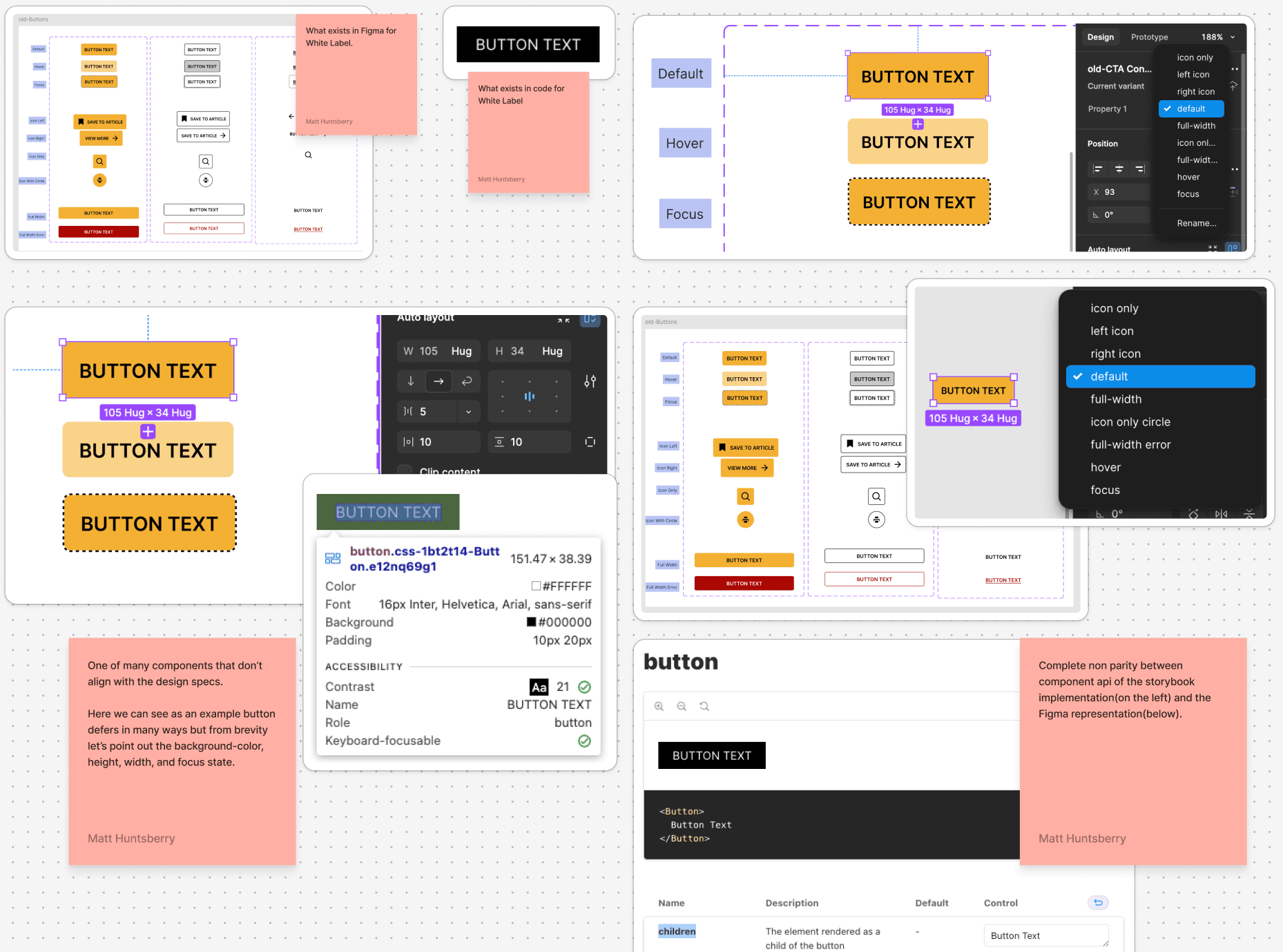
Decision
- Ship one canonical Button with a shared property model in design and code
- Standardize variant axes across both surfaces
- Variant axis values include solid, outline, and ghost
- Tone axis values include default, emphasis, and danger
- Size axis values include small, medium, and large
- Icon axis values include none, leading, trailing, and icon only
- Bind all styles to semantic tokens and remove raw color values
- Define one accessibility contract for keyboard, focus, and loading behavior
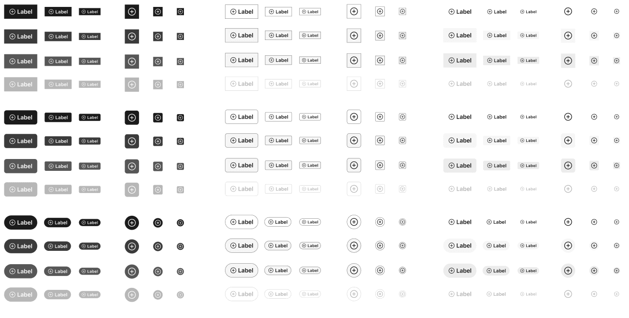
Implementation
- Built a full Figma component set with properties that match code props
- Created Storybook docs with prop tables, usage guidance, and live states
- Added tests for prop mapping, accessibility checks, and visual regressions
- Published migration guidance for teams using legacy button classes
Validation
- Ran parity audits between Figma and Storybook for each state
- Verified contrast and focus visibility across themes
- Piloted with partner teams, then fixed naming and edge cases before broad release
Rollout
- Released as the default path with migration support and office hours
- Set deprecation windows for legacy variants and tracked migration completion
Impact
- Adoption moved from 14 percent to 70 percent over 12 weeks
- Detachment dropped by 70 percent. Detachment is defined as component instances detached from source or carrying non approved visual overrides.
- Accessibility issues related to Button moved from 23 to 7 in one quarter
- Support requests on button usage moved from 31 to 12 per month
What changed most was decision quality. Teams stopped debating which button to use and started shipping with a shared model.
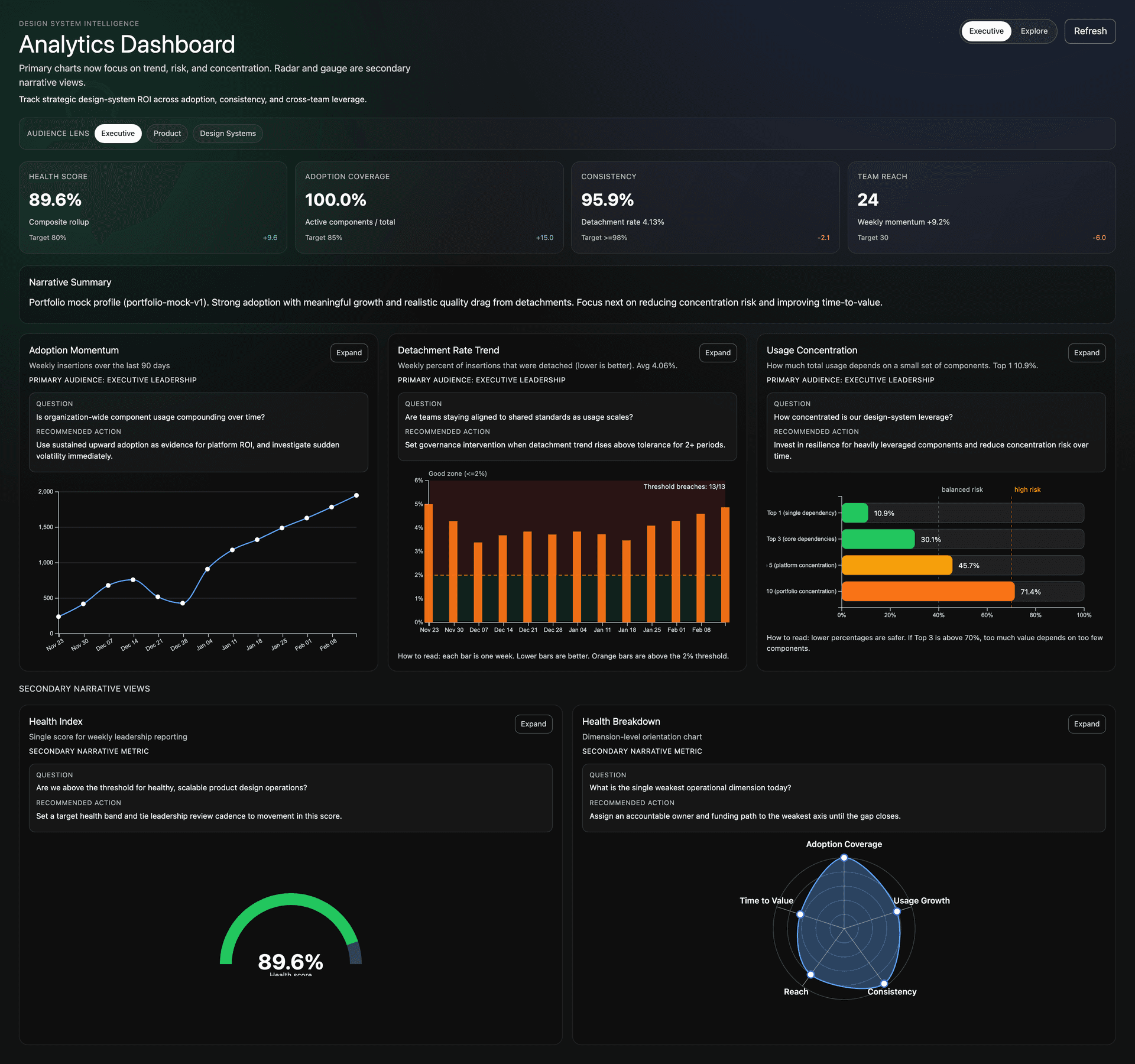
Evidence and Metrics
The dashboard turns subjective feedback into visible system signals. I built a Figma analytics view that surfaces health scores, adoption momentum, detachment trends, and usage concentration—so we can prioritize based on evidence instead of opinion.
Top-level metrics
- Health Score—composite rollup for weekly leadership reporting (target 80%+)
- Adoption Coverage—active components vs total, target 85%+
- Consistency—driven by detachment rate, target 98%+
- Team Reach—count of teams using the system, with weekly momentum
Narrative-driven charts
- Adoption Momentum—weekly insertions over 90 days; answers whether usage is compounding
- Detachment Rate Trend—weekly percent detached (lower is better); governance trigger when above tolerance
- Usage Concentration—how much value depends on few components; flags concentration risk
- Health Index and Health Breakdown—single score plus dimension-level view for the weakest operational axis
Each chart includes a question, recommended action, and audience lens (Executive, Product, Design Systems). That structure keeps feedback tied to decisions, not just data.
Over a 12 week cycle with this kind of visibility, we saw 70 percent lower detachment and 5 times higher adoption. The dashboard did not create the outcome—it gave teams a shared language to act on it.
Key UX Decisions
Leadership patterns are only useful when they change daily delivery decisions in design and engineering.
- Reframed feedback sessions from critique to decision making so teams aligned on problem definition before proposing solutions.
- Used a core versus domain ownership model so teams could move quickly while protecting shared primitives from drift.
- Standardized button API axes across design and code to reduce handoff ambiguity and review overhead.
- Made release notes migration first so teams understood what changed, what to replace, and when to update.
- Structured docs and artifact templates for scan first use to lower adoption friction for distributed teams.
Constraints We Designed For
The operating model and component decisions were designed for organizational and product constraints, not ideal conditions.
- Input modalities. Keyboard, touch, and focus visible interactions had to remain consistent across product surfaces.
- Accessibility. WCAG contrast, semantic structure, and state behavior were treated as non negotiable quality gates.
- Delivery velocity. Teams needed a contribution path that supported deadlines without bypassing system quality controls.
- Localization and content variability. Patterns had to hold up under longer strings and cross market requirements.
- Release coordination. Migration guidance and support windows were required to reduce rollout risk across many teams.
Metric Definitions and Timeframe
Metrics were tracked over 12 weeks after rollout with pre rollout baselines for comparison.
- Adoption. Share of new UI implementation using system components without one off forks. Baseline 14 percent to 70 percent.
- Detachment and drift. Instances detached from source components or carrying non approved overrides. Baseline 30 percent to 9 percent.
- Support load. Monthly button usage and contribution support requests. Baseline 31 requests to 12 requests.
- Accessibility defects. Reported button related accessibility issues per quarter. Baseline 23 issues to 7 issues.
TLDR
I lead design systems through feedback, shared ownership, and operational clarity. The outcome is not only cleaner components. It is stronger team judgment, better adoption, and a system that scales without constant central intervention.