Case study
The System Beneath the System: Re-Architecting Tokens for 48+ Brands
Redesigned our token architecture from raw values to a governed system of primitives, aliases, and themes—powering live theming and design–code sync at scale.
On this page
Executive Summary
Years of legacy token bloat, detached Figma workflows, and hardcoded overrides had left the design system fractured and unsustainable. I led the end-to-end rebuild of our token infrastructure—designing a scalable model of primitives, semantic aliases, and brand themes, delivered through a centralized pipeline via Style Dictionary and the Figma REST API.
This system powered live theme switching across 48+ brands, eliminated overrides, and established design–code parity at scale. More importantly, it laid the groundwork for real-time design system analytics—turning tokens into an operational source of truth.
Problem: Token Chaos at Scale
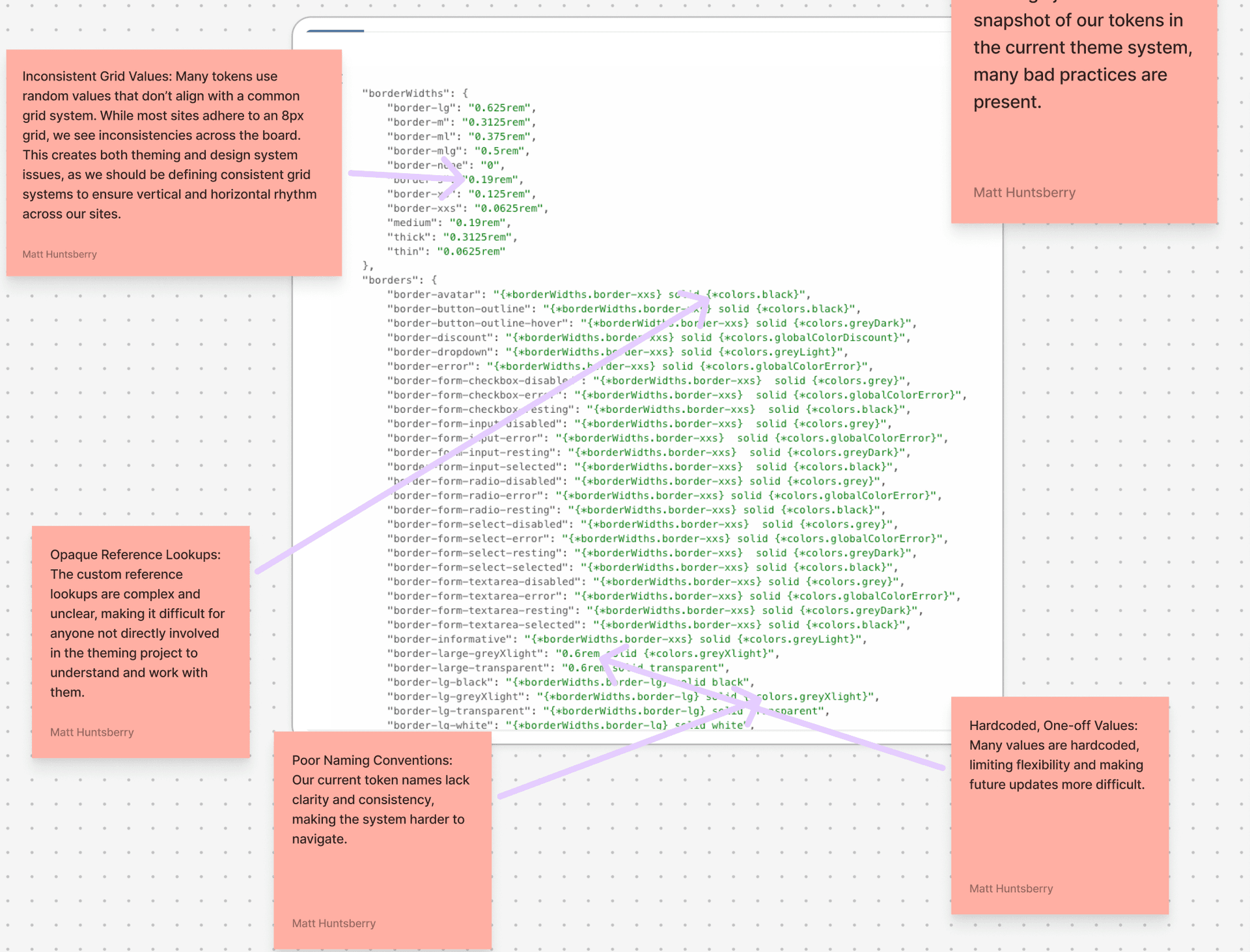
What we called “tokens” were just scattered raw values—no structure, no hierarchy, no source of truth. Designers manually edited JSON files to apply brand themes. Engineering had no reference beyond inconsistent one-off values like 13px, 0.95rem, and 17px, which broke layout rhythm and introduced visual debt across products.
There was no pipeline—no connection between design, code, or documentation. And because components weren’t theme-aware, variants were duplicated and detached to support basic brand styling—creating a system that grew in complexity but not capability.
My Role
As Principal Design Systems Architect, I owned the strategy, design, and delivery of the new token infrastructure—bridging design and engineering to align tools, teams, and outputs. I led a full audit of all legacy token sources and component variants, exposing systemic duplication and drift.
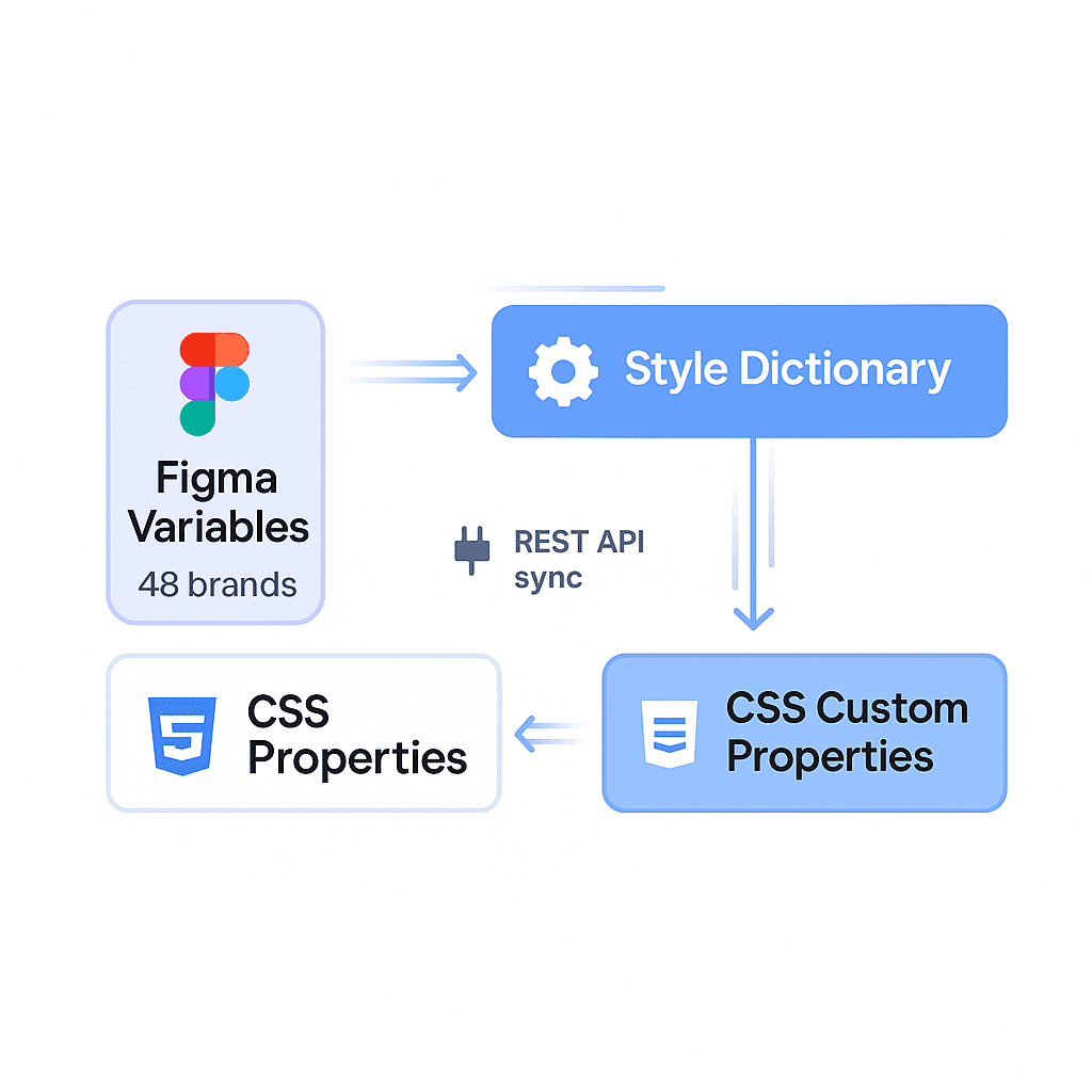
I designed and implemented a structured token model—moving from raw values to a three-tier architecture of primitives → semantic aliases → brand themes. I then built custom Style Dictionary transforms to export those tokens across Tailwind, CSS variables, JavaScript, and Figma Variables, ensuring consistent, mode-aware theming across platforms.
Finally, I integrated token outputs directly into our component system and design tooling—establishing a source of truth that could scale across 48 brands without fragmentation or drift.
The Solution
I designed a platform-oriented token architecture to unify scale, flexibility, and governance. At the foundation were normalized primitives—colors, spacing, radii, typography, and elevation—extended through semantic aliases like buttonBackground, textAccent, and cardShadow. This architecture supported 50+ brand themes and both light/dark modes, without duplication or overrides.
Using Style Dictionary, I built a custom token pipeline that transformed these definitions into multiple target formats—CSS variables, Tailwind tokens, JS/TS constants, and JSON for the Figma REST API. This enabled true cross-platform parity and allowed token updates to instantly cascade across codebases and design tooling.
Storybook Theme Switching
On the Figma side, I automated token creation and theme application using the REST API. Tokens were injected into a white-label base library, with mode switching enabled for brand-specific themes—eliminating the need for designers to detach components or apply styles manually. Previewing brand themes became instant, reliable, and scalable.
Multitheming with Figma Variables
Results
Lessons & Next Step
Design tokens aren’t a design system detail—they’re organizational infrastructure. When centralized and systematized, they become the glue between design, engineering, and QA—accelerating velocity, reducing risk, and eliminating ambiguity.
This work proved that a well-architected token pipeline doesn’t just improve theming—it redefines how product teams scale UI. It also opened the door to intelligent design system analytics—tracking which tokens are used, changed, or extended across brands and platforms.
Ultimately, the success of this system helped influence executive buy-in for Figma Enterprise—turning REST API sync from a prototype into a strategic investment.
Key UX Decisions
These decisions made the token platform usable in day to day delivery, not just technically correct.
- Reduced contribution intake to one guided request template so teams could move from idea to scoped request quickly.
- Split ownership into core and domain so reusable primitives stayed stable while local needs could ship without blocking.
- Standardized component and token naming patterns so search, docs navigation, and code handoff were predictable.
- Shipped release notes in a scan first format so migration steps were obvious and low risk for product teams.
- Prioritized defaults over flexibility in shared primitives to reduce decision fatigue and improve consistency.
Constraints We Designed For
The architecture was built for real product constraints across brands, teams, and release environments.
- Input modalities. Keyboard first interactions, touch targets, and focus visible behavior for consistent access patterns.
- Accessibility. WCAG contrast thresholds, semantic roles, and interaction states that remained reliable in light and dark themes.
- Performance. Token outputs optimized for build time transformation and minimal runtime overhead in product surfaces.
- Localization. Components and text patterns resilient to longer strings and content variability across markets.
- Parity and reliability. Design and code checks built into release flow to catch drift before it reached product teams.
Metric Definitions and Timeframe
The impact numbers are defined against explicit baselines and tracked over one quarter.
- Timeframe. 12 weeks post rollout.
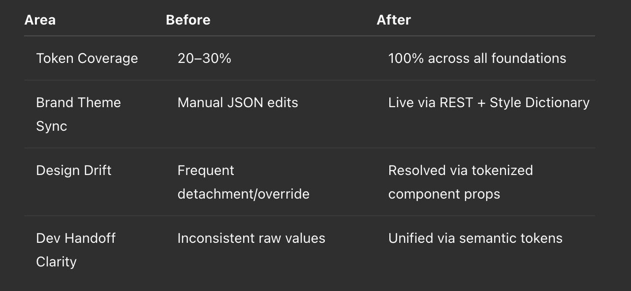
- Adoption. Percent of new UI implementation using system components with no one off forks. Baseline 22 percent to 71 percent.
- Drift and detachment. Component instances detached from source or carrying non approved overrides. Baseline 29 percent to 9 percent.
- Coverage. Percent of recurring UI patterns represented by approved system primitives and guidance. Baseline 54 percent to 83 percent.